Designing ggplots
making clear figures that communicate
2019-11-22
1 / 121
"We need to do everything we can to help our readers understand the meaning of our visualizations and see the same patterns in the data that we see. This usually means less is more. Simplify your figures as much as possible. Remove all features that are tangential to your story"
— Claus O. Wilke
2 / 121
act one: focus and declutter
3 / 121
act one: focus and declutter
act two: narrate and put in context
4 / 121
The cast of characters
5 / 121
Packages
ggplot2gghighlightcowplotpatchwork
6 / 121
data
emperors(data/emperors.csv)gapminder(library(gapminder))nyc_squirrels(data/nyc_squirrels.csv+data/central_park/)diabetes(data/diabetes.csv)la_heat_income(data/los-angeles.geojson)
7 / 121
Themes
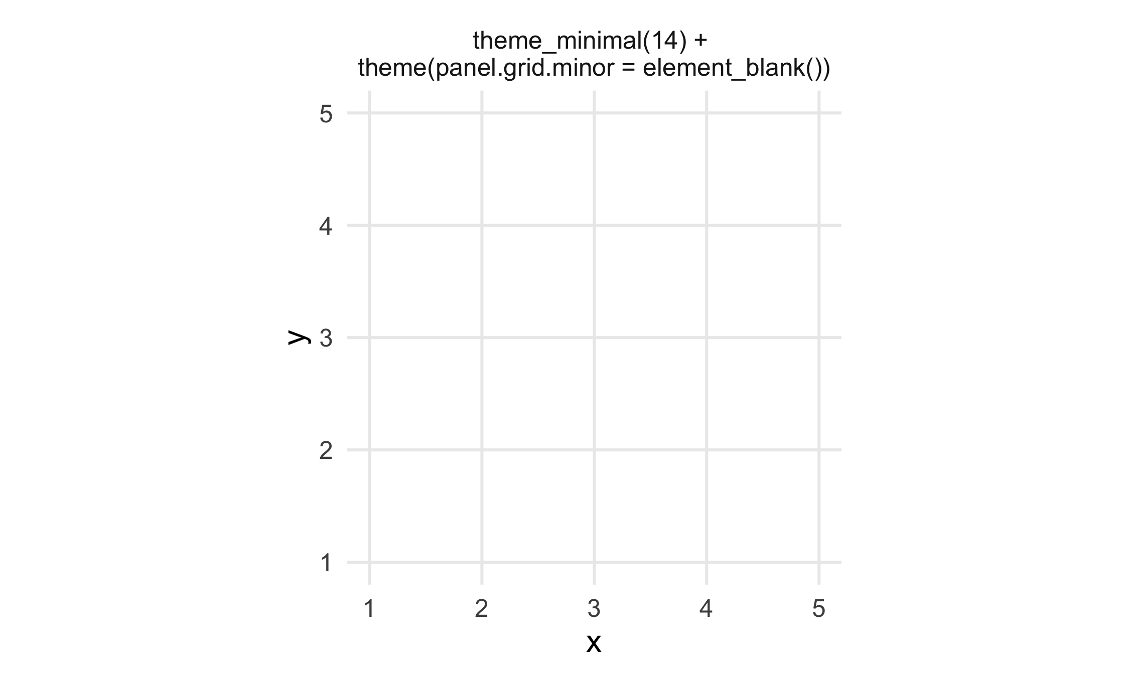
8 / 121
Themes: cowplot
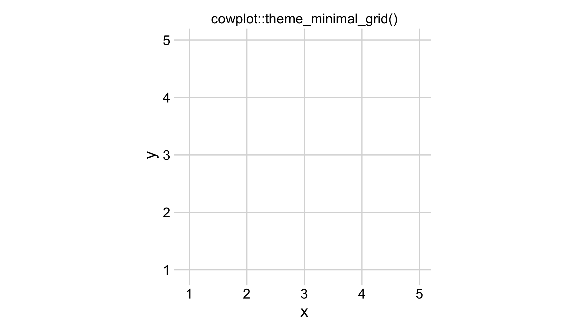
9 / 121
Themes: cowplot
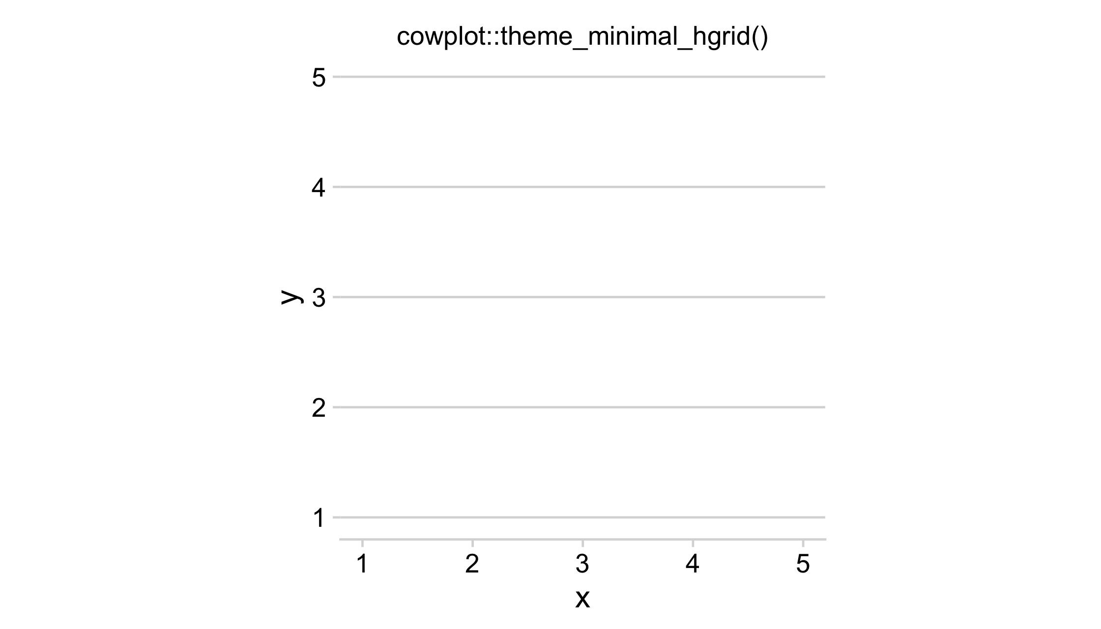
10 / 121
Themes: cowplot
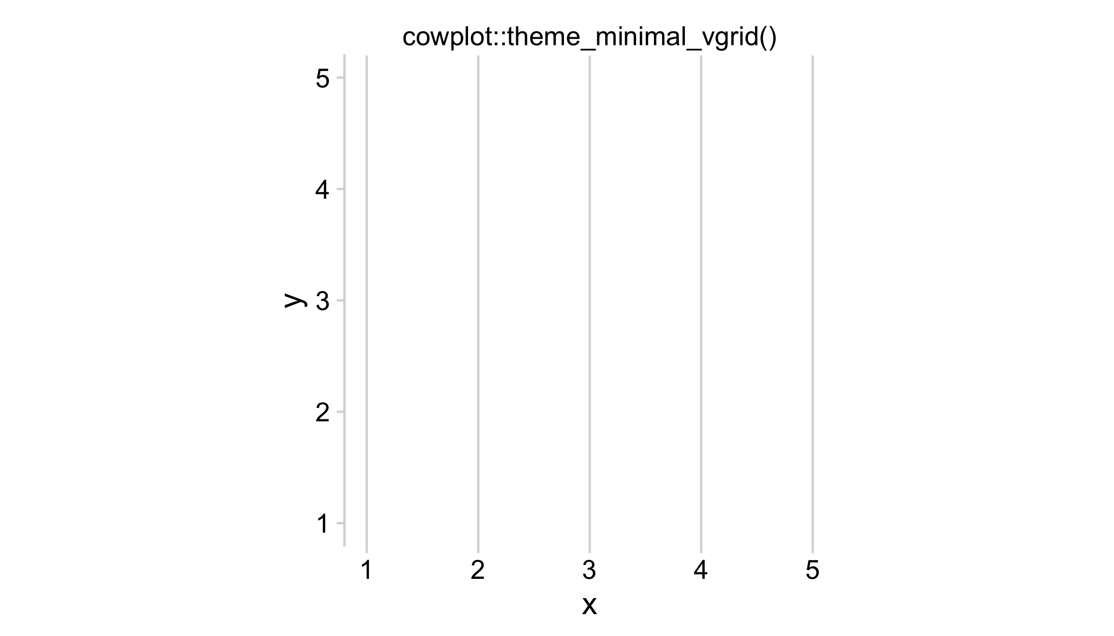
11 / 121
Themes: cowplot
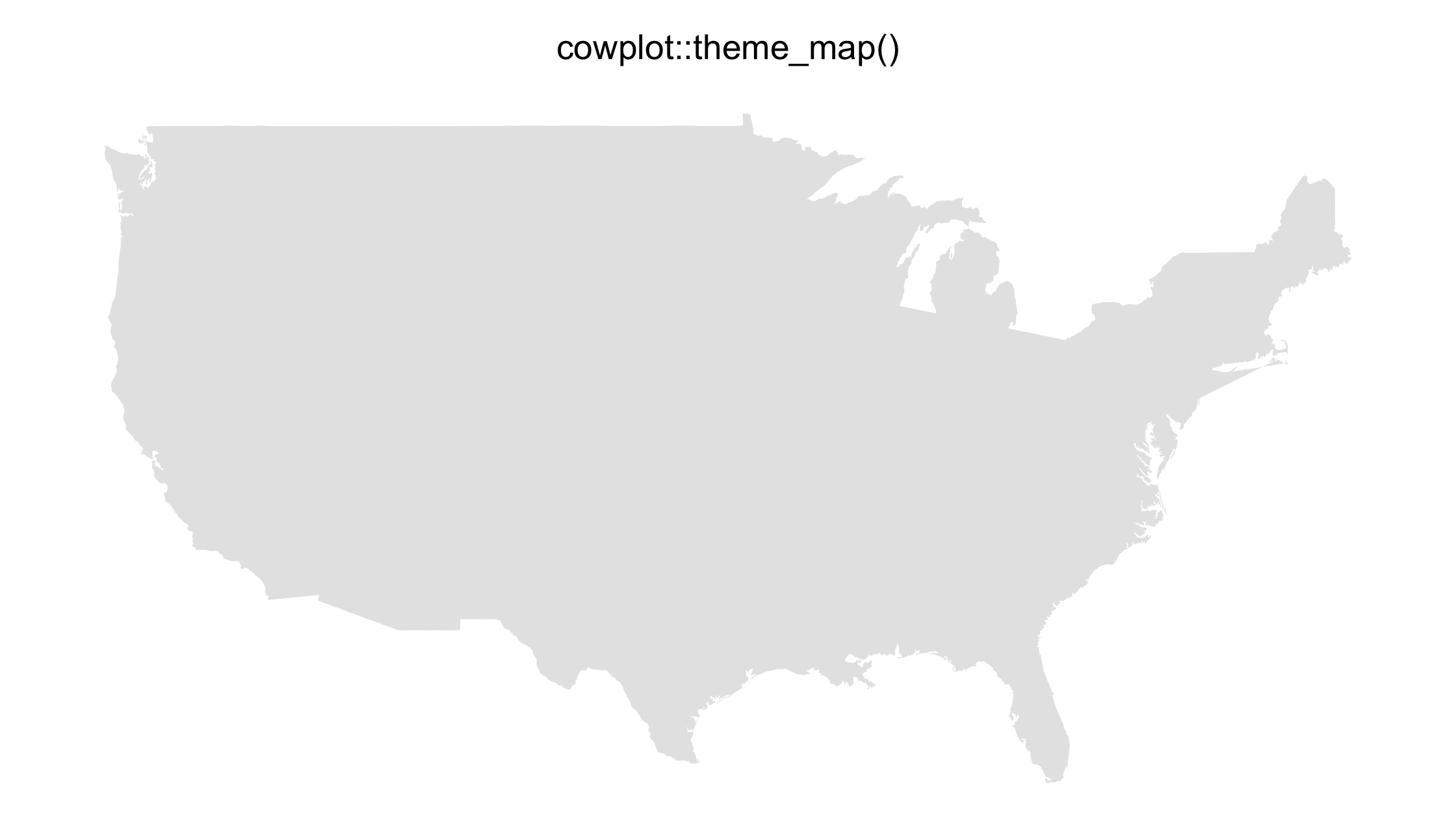
12 / 121
Palettes
Okabe-Ito (colorblindr::palette_OkabeIto())
13 / 121
Palettes

viridis inferno (viridis::inferno())
14 / 121
Palettes

greys ("grey**", grey(.**))
15 / 121
act one: focus and declutter
16 / 121
act one: focus and declutter
or: reducing mental burden in figures
16 / 121
How do we reduce mental burden in our plots?
17 / 121
How do we reduce mental burden in our plots?
simplify aesthetics and highlight
18 / 121
emperors <- read_csv(file.path("data", "emperors.csv"))emperors## # A tibble: 68 x 16## index name name_full birth death birth_cty## <dbl> <chr> <chr> <date> <date> <chr> ## 1 1 Augu… IMPERATO… 0062-09-23 0014-08-19 Rome ## 2 2 Tibe… TIBERIVS… 0041-11-16 0037-03-16 Rome ## 3 3 Cali… GAIVS IV… 0012-08-31 0041-01-24 Antitum ## 4 4 Clau… TIBERIVS… 0009-08-01 0054-10-13 Lugdunum ## 5 5 Nero NERO CLA… 0037-12-15 0068-06-09 Antitum ## 6 6 Galba SERVIVS … 0002-12-24 0069-01-15 Terracina## 7 7 Otho MARCVS S… 0032-04-28 0069-04-16 Terentin…## 8 8 Vite… AVLVS VI… 0015-09-24 0069-12-20 Rome ## 9 9 Vesp… TITVS FL… 0009-11-17 0079-06-24 Falacrine## 10 10 Titus TITVS FL… 0039-12-30 0081-09-13 Rome ## # … with 58 more rows, and 10 more variables:## # birth_prv <chr>, rise <chr>, reign_start <date>,## # reign_end <date>, cause <chr>, killer <chr>, …19 / 121
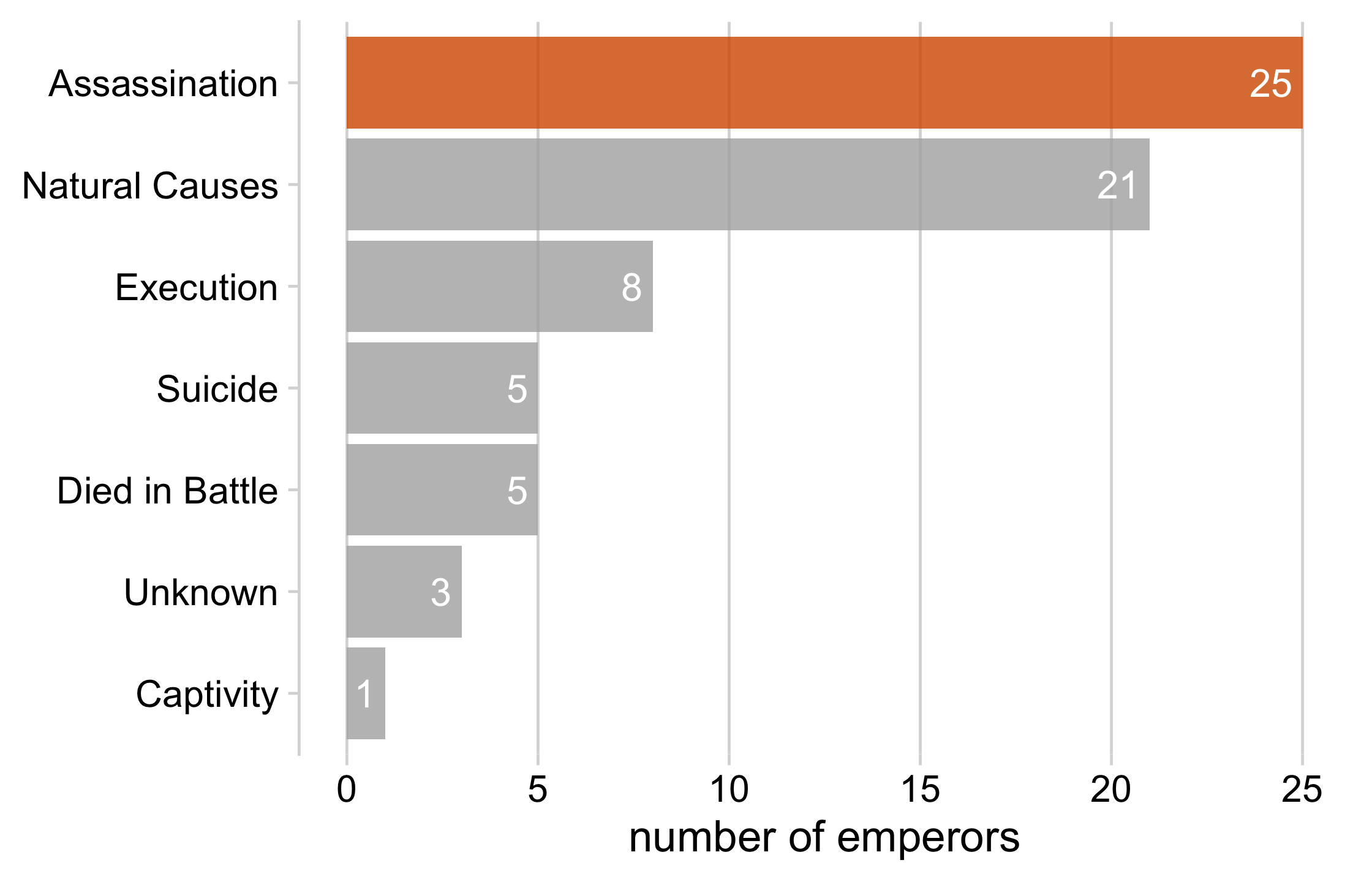
emperors %>% count(cause) %>% ggplot(aes(x = n, y = cause)) + geom_col() + geom_text( aes(label = n, x = n - .25), color = "white", size = 5, hjust = 1 ) + cowplot::theme_minimal_vgrid(16) + theme( axis.title.y = element_blank(), legend.position = "none" ) + xlab("number of emperors")20 / 121
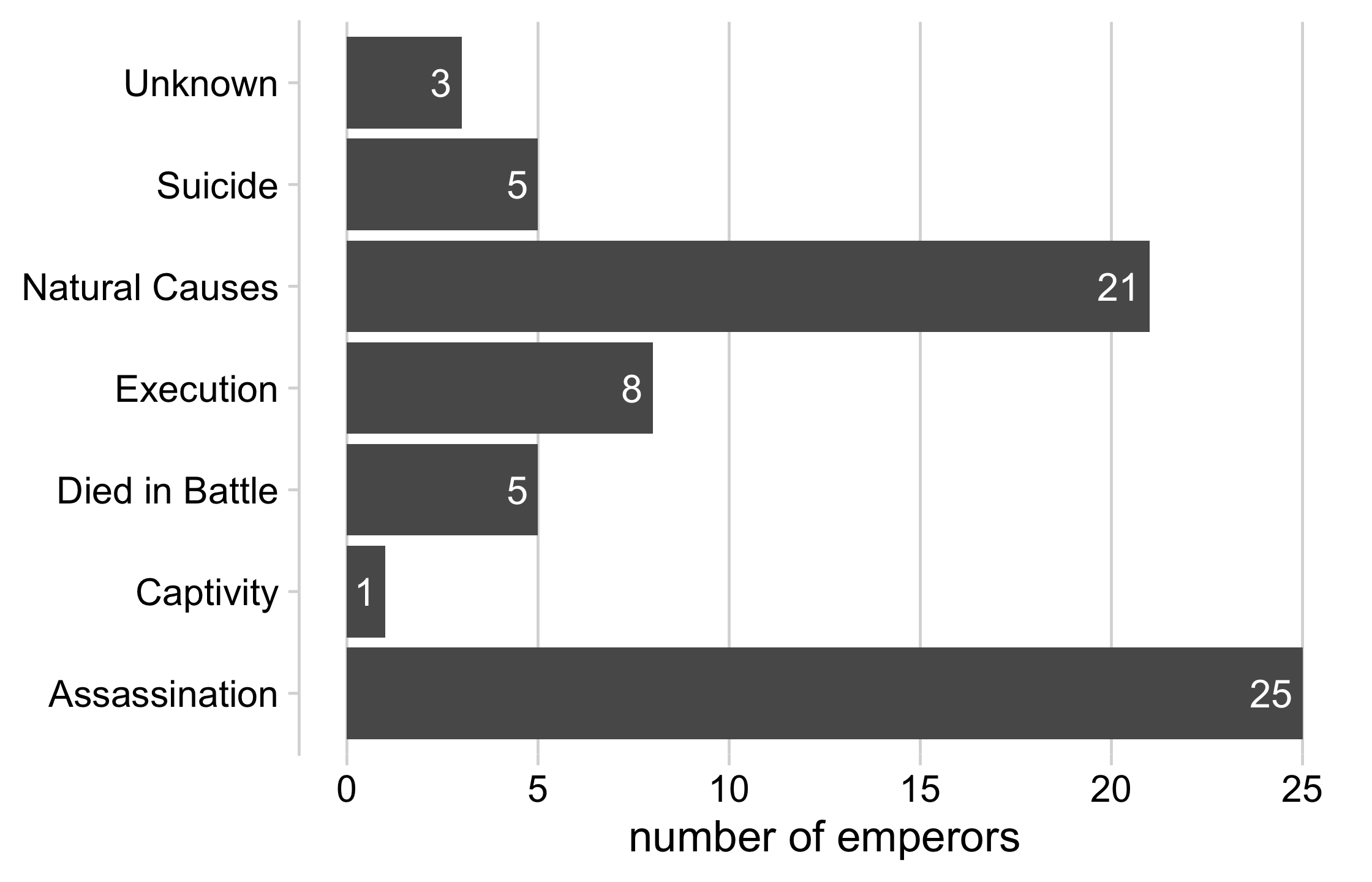
21 / 121
emperors %>% count(cause) %>% arrange(n) %>% mutate(cause = fct_inorder(cause)) %>% ggplot(aes(x = n, y = cause)) + geom_col() + geom_text( aes(label = n, x = n - .25), color = "white", size = 5, hjust = 1 ) + cowplot::theme_minimal_vgrid(16) + theme( axis.title.y = element_blank(), legend.position = "none" ) + xlab("number of emperors")22 / 121
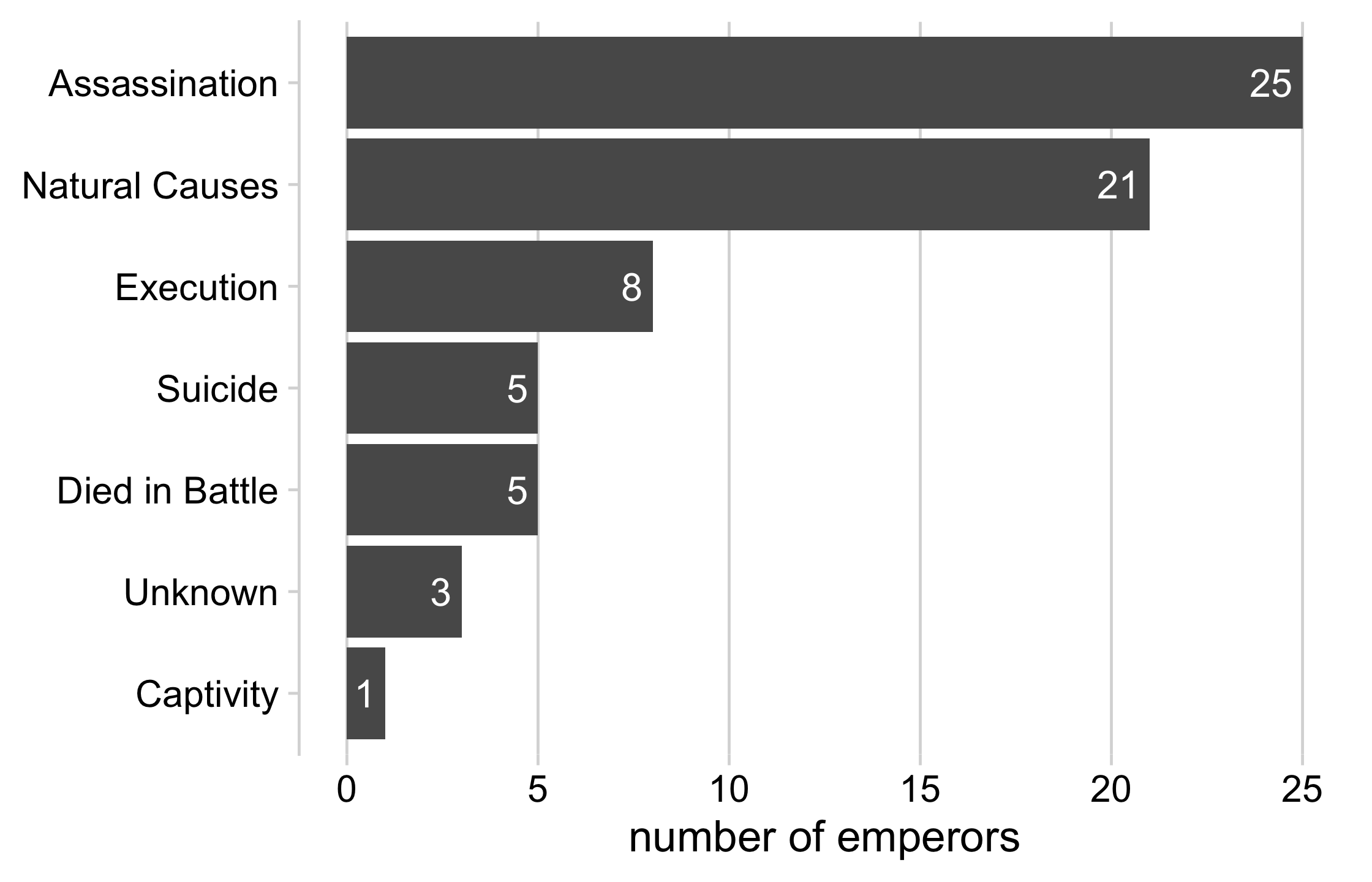
23 / 121
emperors_assassinated <- emperors %>% count(cause) %>% arrange(n) %>% mutate( assassinated = ifelse(cause == "Assassination", TRUE, FALSE), cause = fct_inorder(cause) )24 / 121
emperors_assassinated %>% ggplot(aes(x = n, y = cause, fill = assassinated)) + geom_col() + geom_text( aes(label = n, x = n - .25), color = "white", size = 5, hjust = 1 ) + cowplot::theme_minimal_vgrid(16) + theme( axis.title.y = element_blank(), legend.position = "none" ) + scale_fill_manual( name = NULL, values = c("#B0B0B0D0", "#D55E00D0") ) + xlab("number of emperors")25 / 121
26 / 121
Your Turn 1
27 / 121
Your Turn 1
Read in the emperors data (no need to change this part of the code)
Sort the data using arrange() by the number of each type of killer
Take a look at the data up until this point. Pick something you find interesting that you want to highlight. Then, in mutate(), create a new variable that is TRUE if killer matches the category you want to highlight and FALSE otherwise
Use the variable you just created in the fill aesthetic of the ggplot call
Finally, use scale_fill_manual() to add the fill colors. Set values to c("#B0B0B0D0", "#D55E00D0").
28 / 121
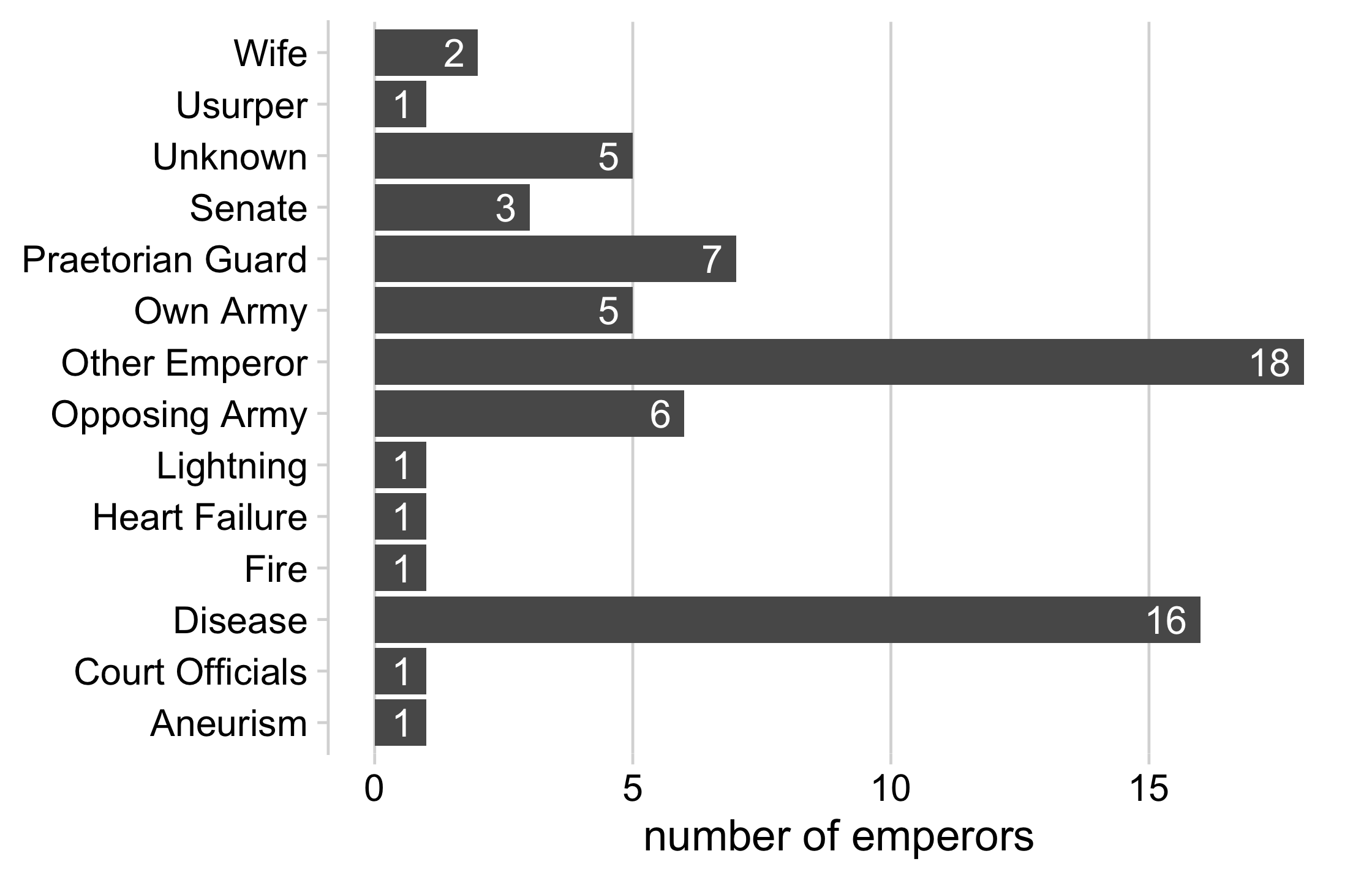
emperor_killers <- emperors %>% # group the least common killers to "other" mutate(killer = fct_lump(killer, 10)) %>% count(killer) %>% arrange(n)29 / 121
emperor_killers## # A tibble: 14 x 2## killer n## <fct> <int>## 1 Aneurism 1## 2 Court Officials 1## 3 Fire 1## 4 Heart Failure 1## 5 Lightning 1## 6 Usurper 1## 7 Wife 2## 8 Senate 3## 9 Own Army 5## 10 Unknown 5## 11 Opposing Army 6## 12 Praetorian Guard 7## 13 Disease 16## 14 Other Emperor 1830 / 121
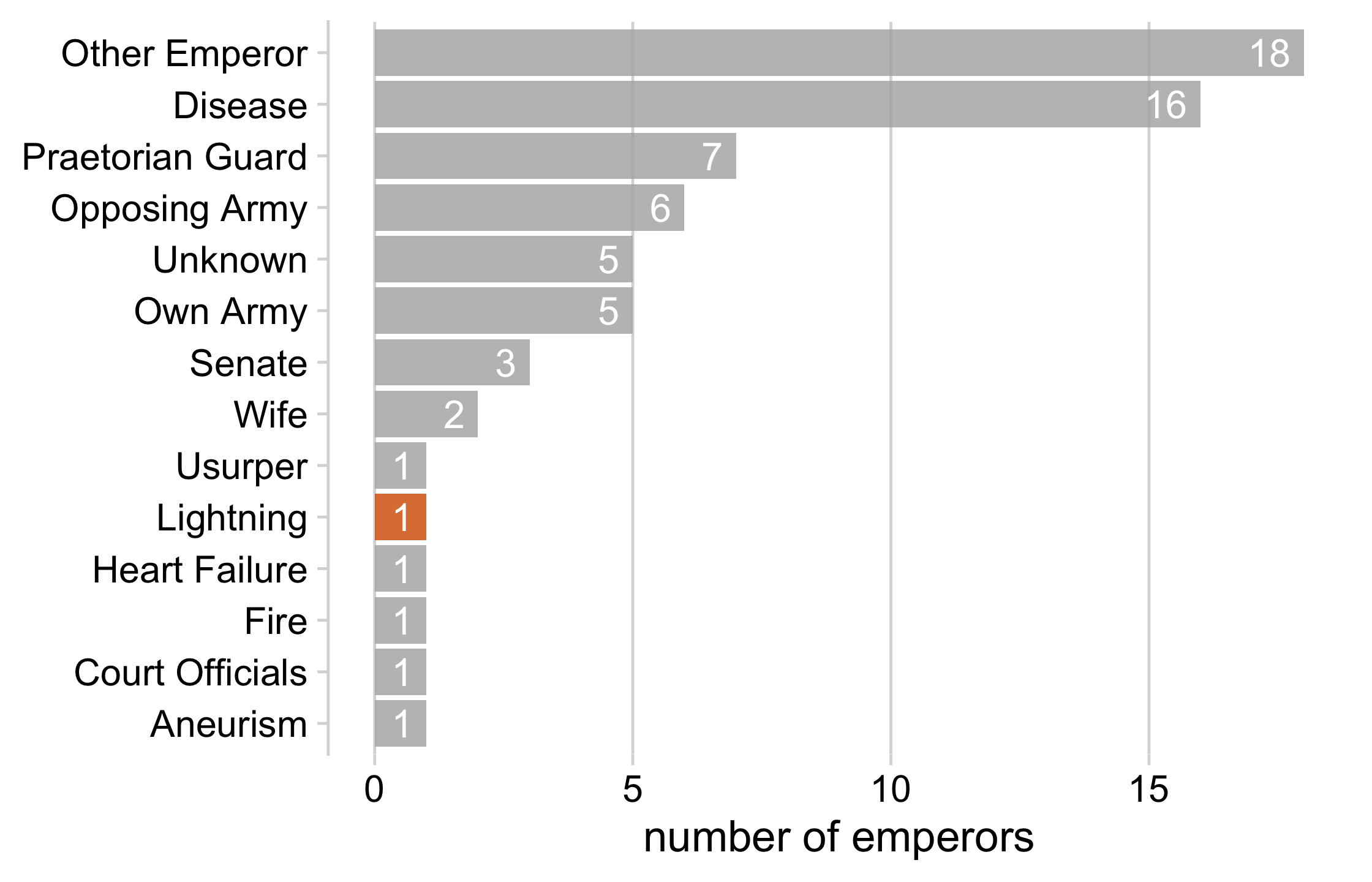
lightning_plot <- emperor_killers %>% mutate( lightning = ifelse(killer == "Lightning", TRUE, FALSE), # use `fct_inorder()` to maintain the way we sorted the data killer = fct_inorder(killer) ) %>% ggplot(aes(x = n, y = killer, fill = lightning)) + geom_col() + geom_text( aes(label = n, x = n - .25), color = "white", size = 5, hjust = 1 ) + cowplot::theme_minimal_vgrid(16) + theme( axis.title.y = element_blank(), legend.position = "none" ) + scale_fill_manual(values = c("#B0B0B0D0", "#D55E00D0")) + xlab("number of emperors")lightning_plot31 / 121
32 / 121
Use color to focus attention
1 2 3 4 5 6 7 8 9
33 / 121
Use color to focus attention
1 2 3 4 5 6 7 8 9
1 2 3 4 5 6 7 8 9
34 / 121
How do we reduce mental burden in our plots?
simplify aesthetics and highlight
design figures without legends
35 / 121
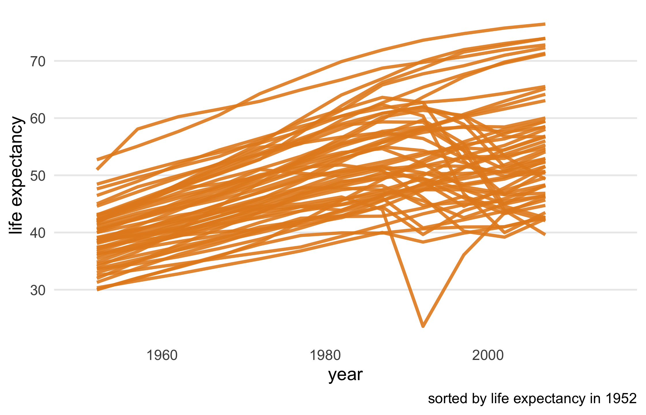
library(gapminder)gapminder## # A tibble: 1,704 x 6## country continent year lifeExp pop gdpPercap## <fct> <fct> <int> <dbl> <int> <dbl>## 1 Afghanistan Asia 1952 28.8 8425333 779.## 2 Afghanistan Asia 1957 30.3 9240934 821.## 3 Afghanistan Asia 1962 32.0 10267083 853.## 4 Afghanistan Asia 1967 34.0 11537966 836.## 5 Afghanistan Asia 1972 36.1 13079460 740.## 6 Afghanistan Asia 1977 38.4 14880372 786.## 7 Afghanistan Asia 1982 39.9 12881816 978.## 8 Afghanistan Asia 1987 40.8 13867957 852.## 9 Afghanistan Asia 1992 41.7 16317921 649.## 10 Afghanistan Asia 1997 41.8 22227415 635.## # … with 1,694 more rows36 / 121
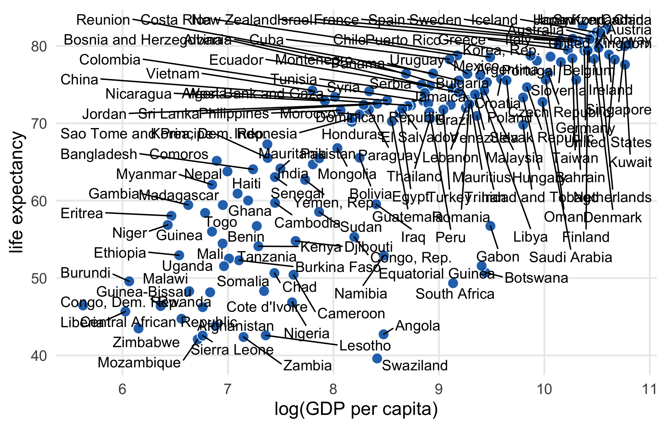
gapminder %>% filter(year == 2007) %>% ggplot(aes(log(gdpPercap), lifeExp)) + geom_point( aes(color = country), size = 3.5, alpha = .9 ) + theme_minimal(14) + theme(panel.grid.minor = element_blank()) + labs( x = "log(GDP per capita)", y = "life expectancy" )37 / 121
38 / 121
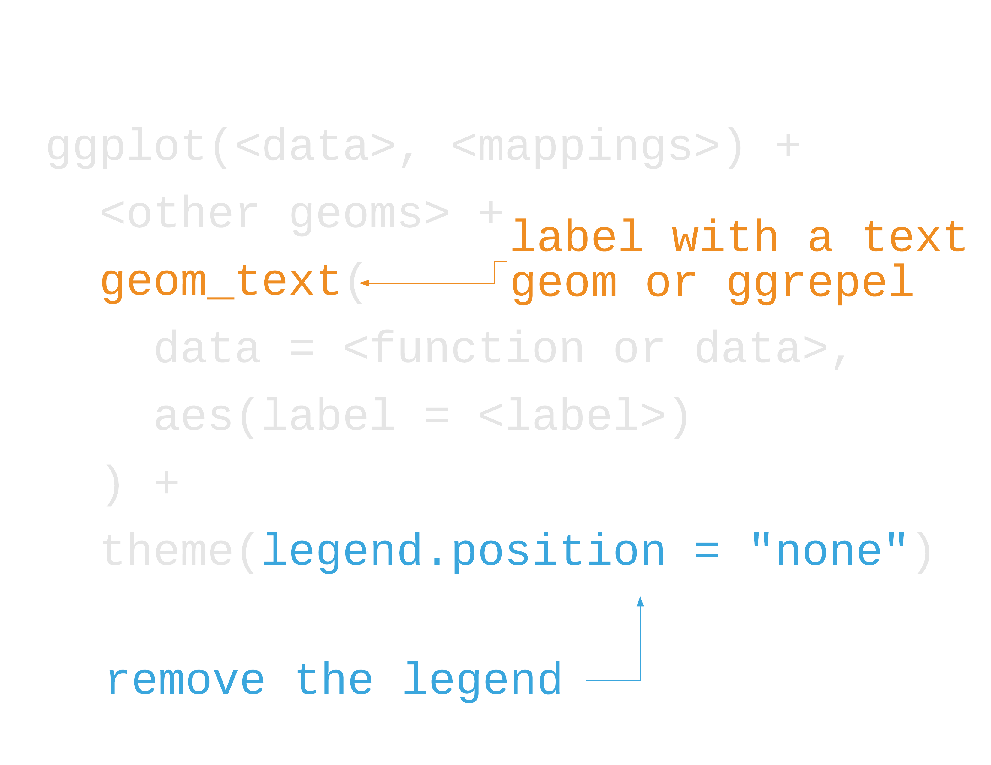
Direct labeling
- Label data directly (maybe a subset)
- Remove the legend
- Use proximity and similarity (e.g. same color)
39 / 121

40 / 121
41 / 121
42 / 121
ggrepel: Repel overlapping text
library(ggrepel)43 / 121
ggrepel: Repel overlapping text
library(ggrepel)geom_text_repel()
geom_label_repel()
43 / 121
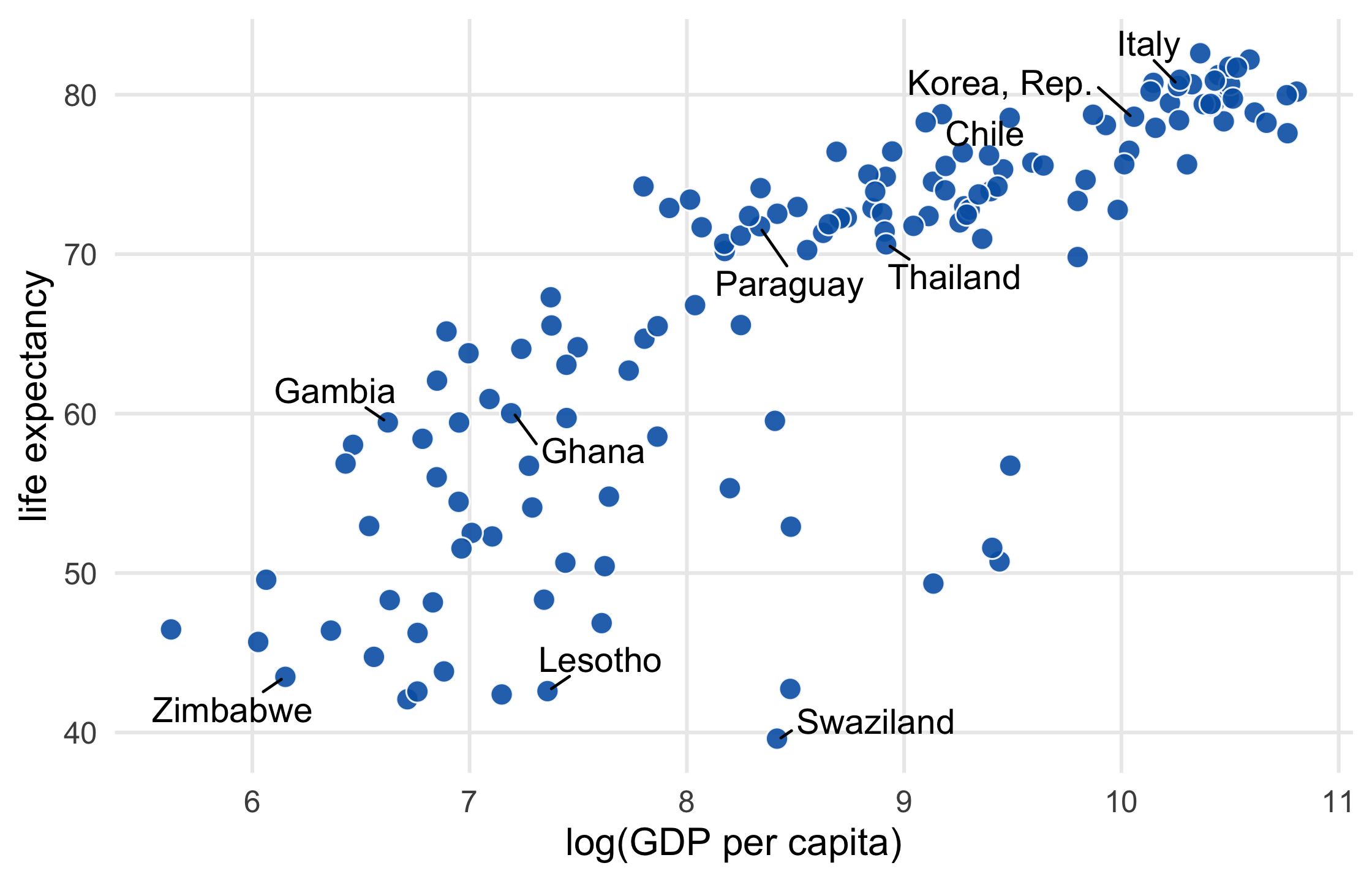
gapminder %>% filter(year == 2007) %>% ggplot(aes(log(gdpPercap), lifeExp)) + geom_point( size = 3.5, alpha = .9, shape = 21, col = "white", fill = "#0162B2" ) + geom_text_repel(aes(label = country)) + theme_minimal(14) + theme(panel.grid.minor = element_blank()) + labs( x = "log(GDP per capita)", y = "life expectancy" )44 / 121
45 / 121
Your Turn 2
Use sample() to select 10 random countries to plot (run the set.seed() line first if you want the same results)
In the mutate() call, check if country is one of the countries in ten_countries. If it's not, make the label an empty string (""),
Add the text repel geom from ggrepel. Set the label aesthetic using the variable just created in mutate()
46 / 121
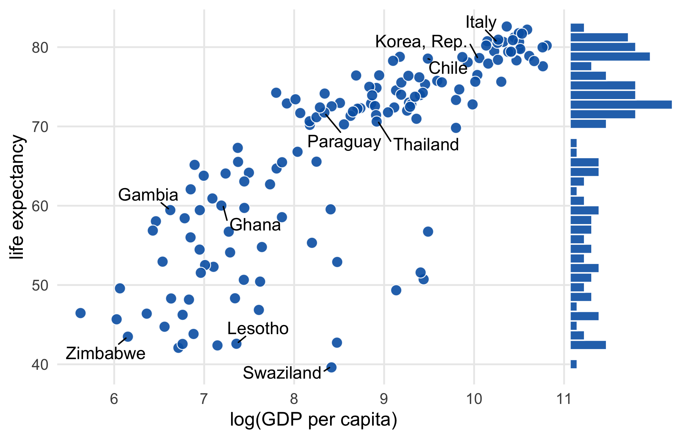
library(gapminder)library(ggrepel)set.seed(42)ten_countries <- gapminder$country %>% levels() %>% sample(10)ten_countries## [1] "Ghana" "Italy" "Lesotho" "Swaziland" "Zimbabwe" ## [6] "Thailand" "Gambia" "Chile" "Korea, Rep." "Paraguay"47 / 121
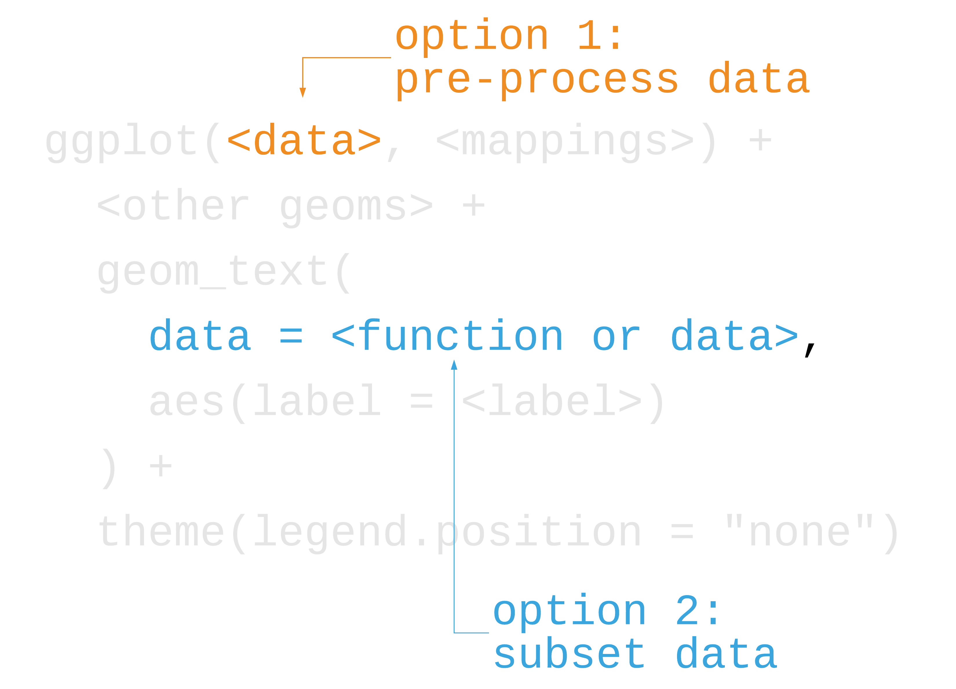
p1 <- gapminder %>% filter(year == 2007) %>% mutate( label = ifelse( country %in% ten_countries, as.character(country), "" ) ) %>% ggplot(aes(log(gdpPercap), lifeExp)) + geom_point( size = 3.5, alpha = .9, shape = 21, col = "white", fill = "#0162B2" )48 / 121
scatter_plot <- p1 + geom_text_repel( aes(label = label), size = 4.5, point.padding = .2, box.padding = .3, force = 1, min.segment.length = 0 ) + theme_minimal(14) + theme( legend.position = "none", panel.grid.minor = element_blank() ) + labs( x = "log(GDP per capita)", y = "life expectancy" )scatter_plot49 / 121
50 / 121
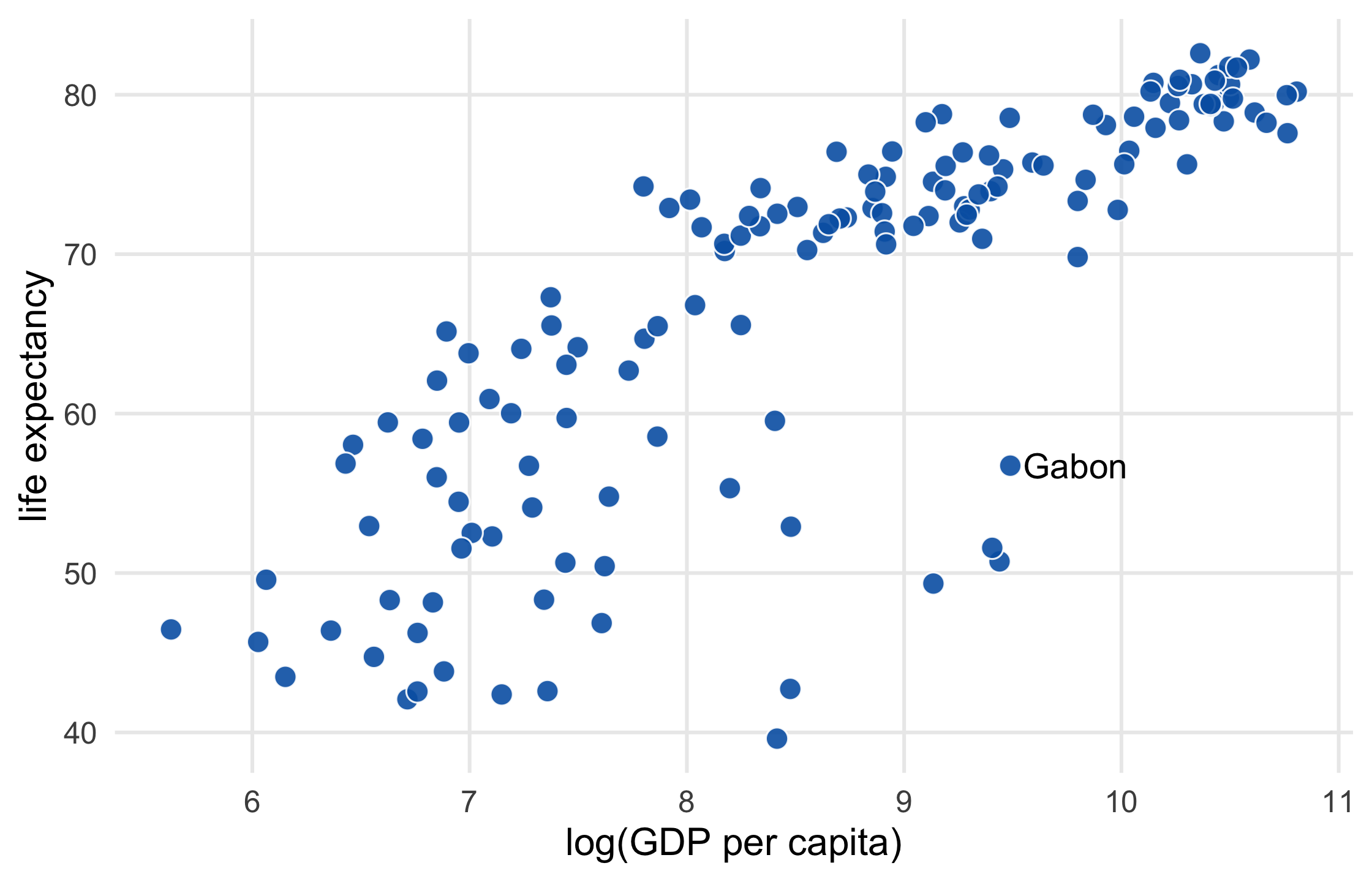
p1 + geom_text( data = function(x) filter(x, country == "Gabon"), aes(label = country), size = 4.5, hjust = 0, nudge_x = .06 ) + theme_minimal(14) + theme( legend.position = "none", panel.grid.minor = element_blank() ) + labs( x = "log(GDP per capita)", y = "life expectancy" )51 / 121
52 / 121
How do we reduce mental burden in our plots?
simplify aesthetics and highlight
design figures without legends
hack geoms and legends and even the plot itself
53 / 121
Inserting plot objects into the axis
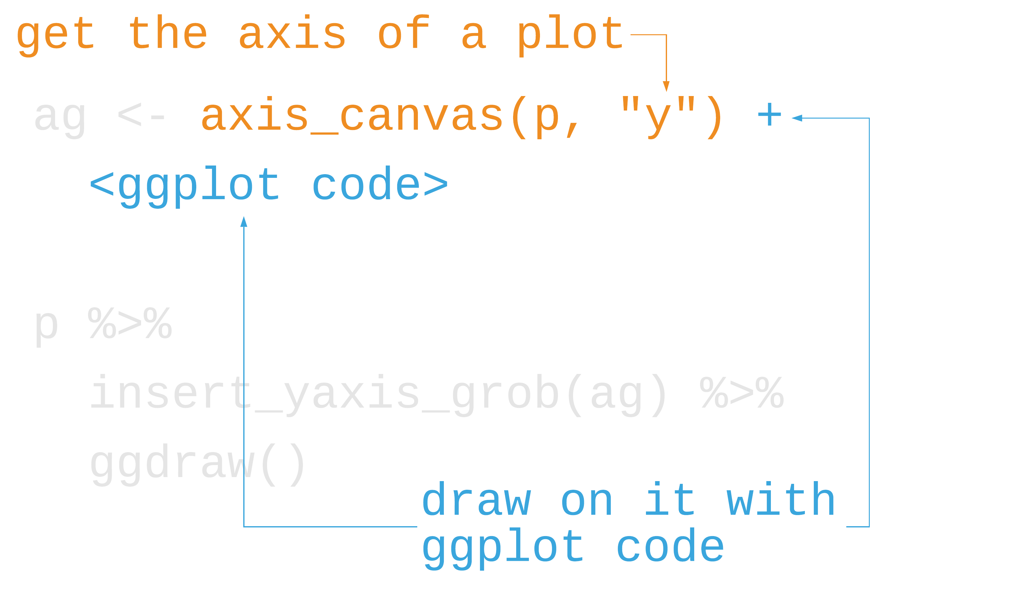
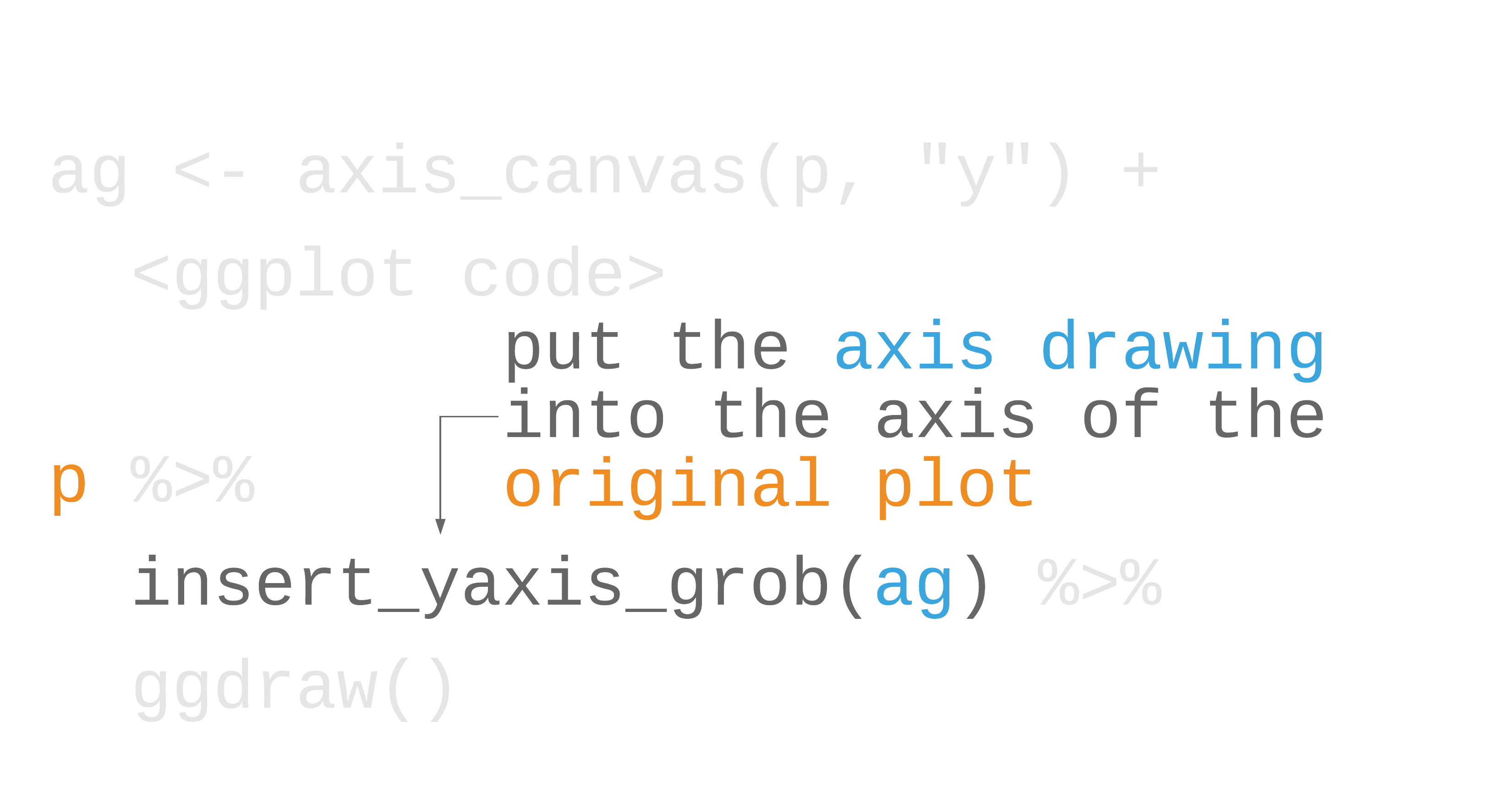
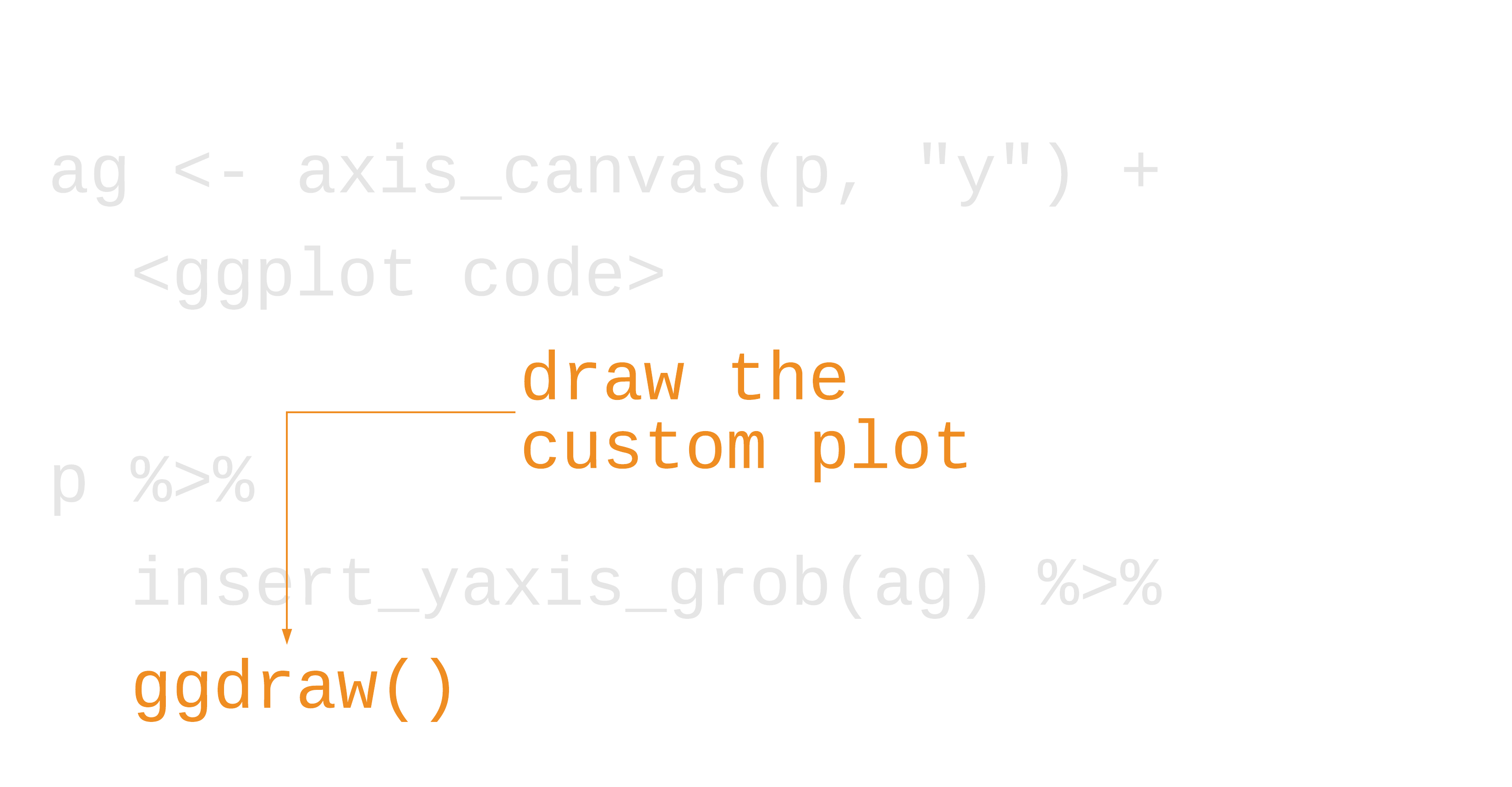
library(cowplot)54 / 121
Inserting plot objects into the axis
library(cowplot)marginal_histogram <- axis_canvas(scatter_plot, "y") + geom_histogram( data = gapminder %>% filter(year == 2007), bins = 40, aes(y = lifeExp), fill = "#0162B2E6", color = "white" )scatter_plot %>% insert_yaxis_grob(marginal_histogram) %>% ggdraw()55 / 121
56 / 121

57 / 121
58 / 121
59 / 121
60 / 121
Your Turn 3
61 / 121
Your Turn 3
Calculate the placement of the labels: in the summarize() call, create a variable called y that is the maximum lifeExp value for every continent For the labels, we'll use the continent names, which will be retained automatically.
Remove the legend from the line plot. There are several ways to do so in ggplot2. I like setting legend.position = "none" in theme().
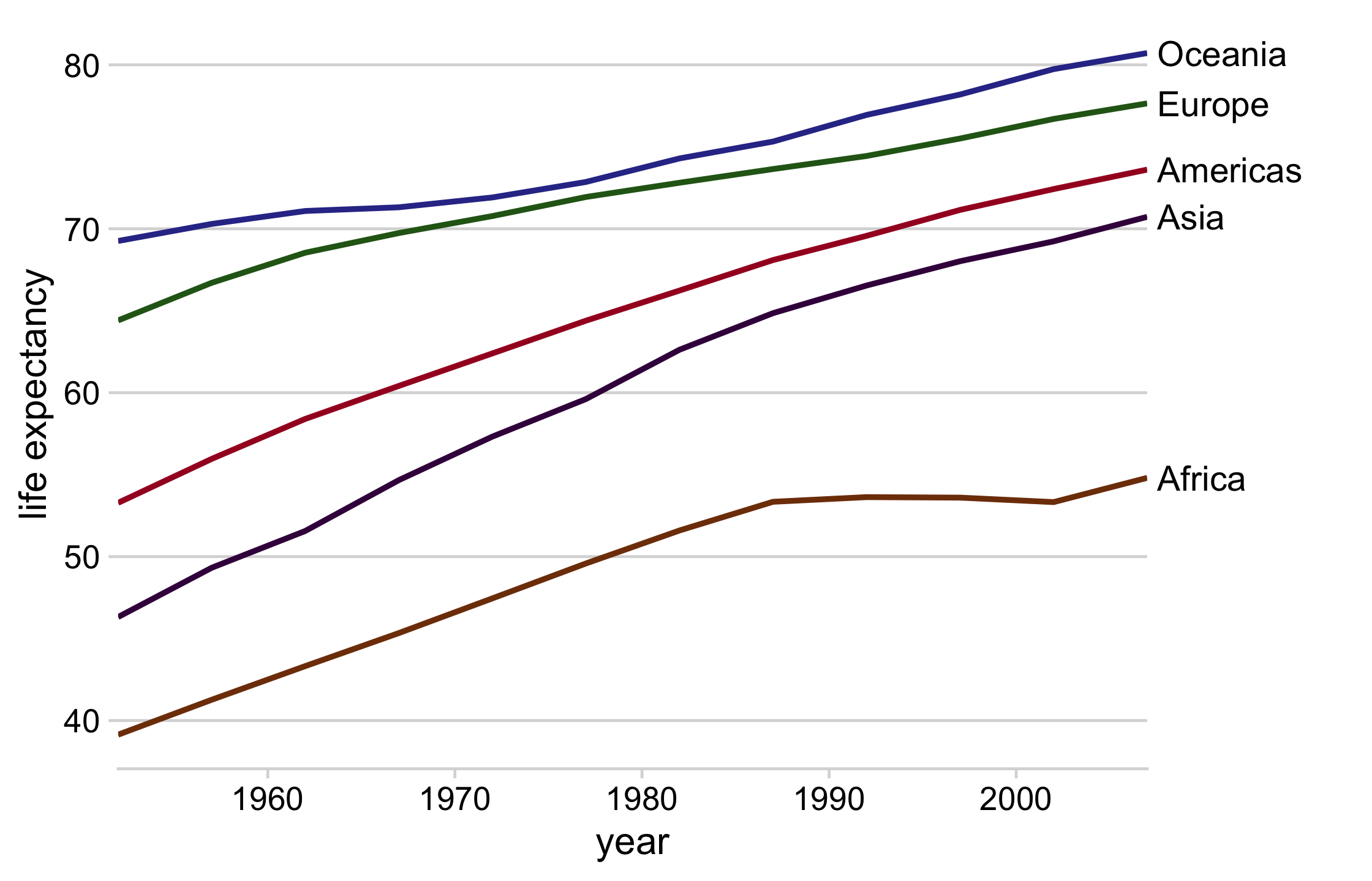
axis_canvas(line_plot, axis = "y") creates a new ggplot2 canvas based on the y axis from line_plot. Add a text geom (using + as you normally would). In the text geom: set data to direct_labels; in aes(), set y = y, label = continent; Outside of aes() set x to 0.05 (to add a little buffer); Make the size of the text 4.5; Set the horizontal justification to 0
Use insert_yaxis_grob() to take lineplot and insert direct_labels_axis.
Draw the new plot with ggdraw()
62 / 121
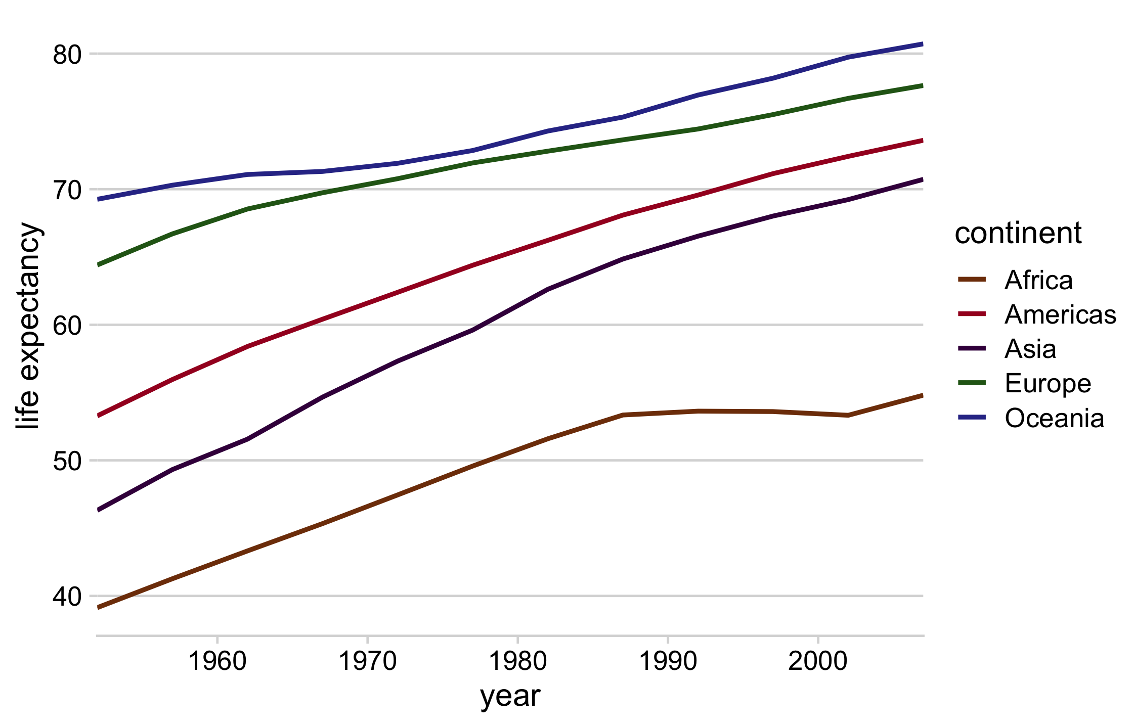
library(cowplot)# get the mean life expectancy by continent and yearcontinent_data <- gapminder %>% group_by(continent, year) %>% summarise(lifeExp = mean(lifeExp))direct_labels <- continent_data %>% group_by(continent) %>% summarize(y = max(lifeExp))63 / 121
line_plot <- continent_data %>% ggplot(aes(year, lifeExp, col = continent)) + geom_line(size = 1) + theme_minimal_hgrid() + theme(legend.position = "none") + scale_color_manual(values = continent_colors) + scale_x_continuous(expand = expansion()) + labs(y = "life expectancy")64 / 121
direct_labels_axis <- axis_canvas(line_plot, axis = "y") + geom_text( data = direct_labels, aes(y = y, label = continent), x = .05, size = 4.5, hjust = 0 )p_direct_labels <- insert_yaxis_grob(line_plot, direct_labels_axis)ggdraw(p_direct_labels)65 / 121
66 / 121
How do we reduce mental burden in our plots?
simplify aesthetics and highlight
design figures without legends
hack geoms and legends and even the plot itself
use facets and data shadows to plot overlapping data
67 / 121
Using facets to declutter data
- Facets (or small multiples) are direct labeling for subsets
- Put them into context with data shadows
68 / 121
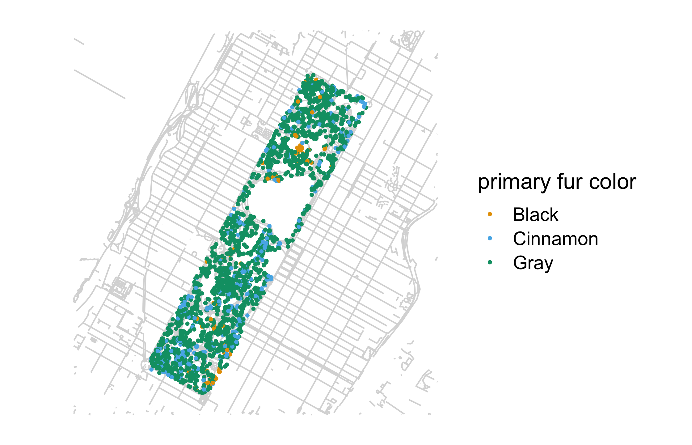
nyc_squirrels <- read_csv(file.path("data", "nyc_squirrels.csv"))central_park <- sf::read_sf(file.path("data", "central_park"))69 / 121
nyc_squirrels <- read_csv(file.path("data", "nyc_squirrels.csv"))central_park <- sf::read_sf(file.path("data", "central_park"))nyc_squirrels %>% drop_na(primary_fur_color) %>% ggplot() + geom_sf(data = central_park, color = "grey85") + geom_point( aes(x = long, y = lat, color = primary_fur_color), size = .8 ) + cowplot::theme_map(16) + colorblindr::scale_color_OkabeIto(name = "primary fur color")69 / 121
70 / 121
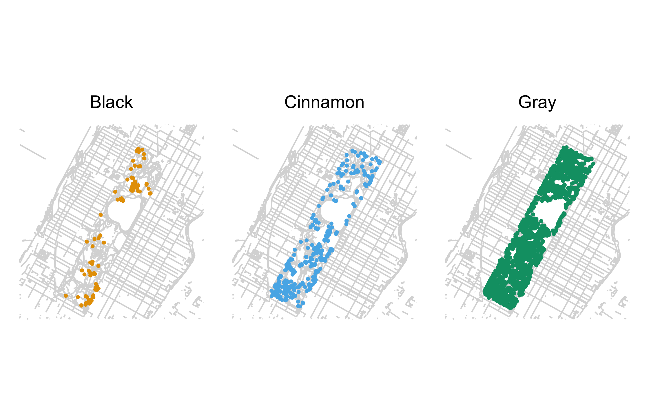
nyc_squirrels %>% drop_na(primary_fur_color) %>% ggplot() + geom_sf(data = central_park, color = "grey85") + geom_point( aes(x = long, y = lat, color = primary_fur_color), size = .8 ) + facet_wrap(vars(primary_fur_color)) + cowplot::theme_map(16) + theme(legend.position = "none") + colorblindr::scale_color_OkabeIto()71 / 121
72 / 121
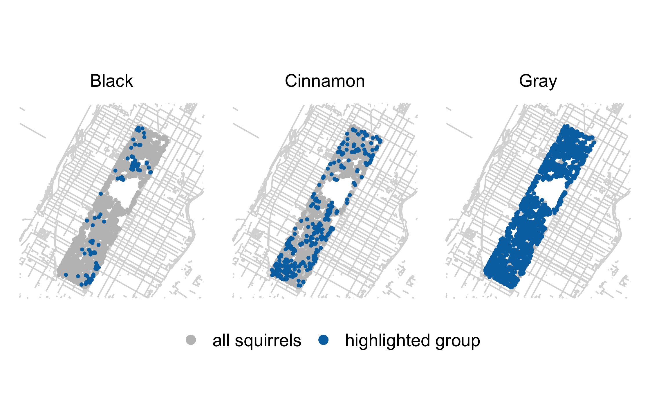
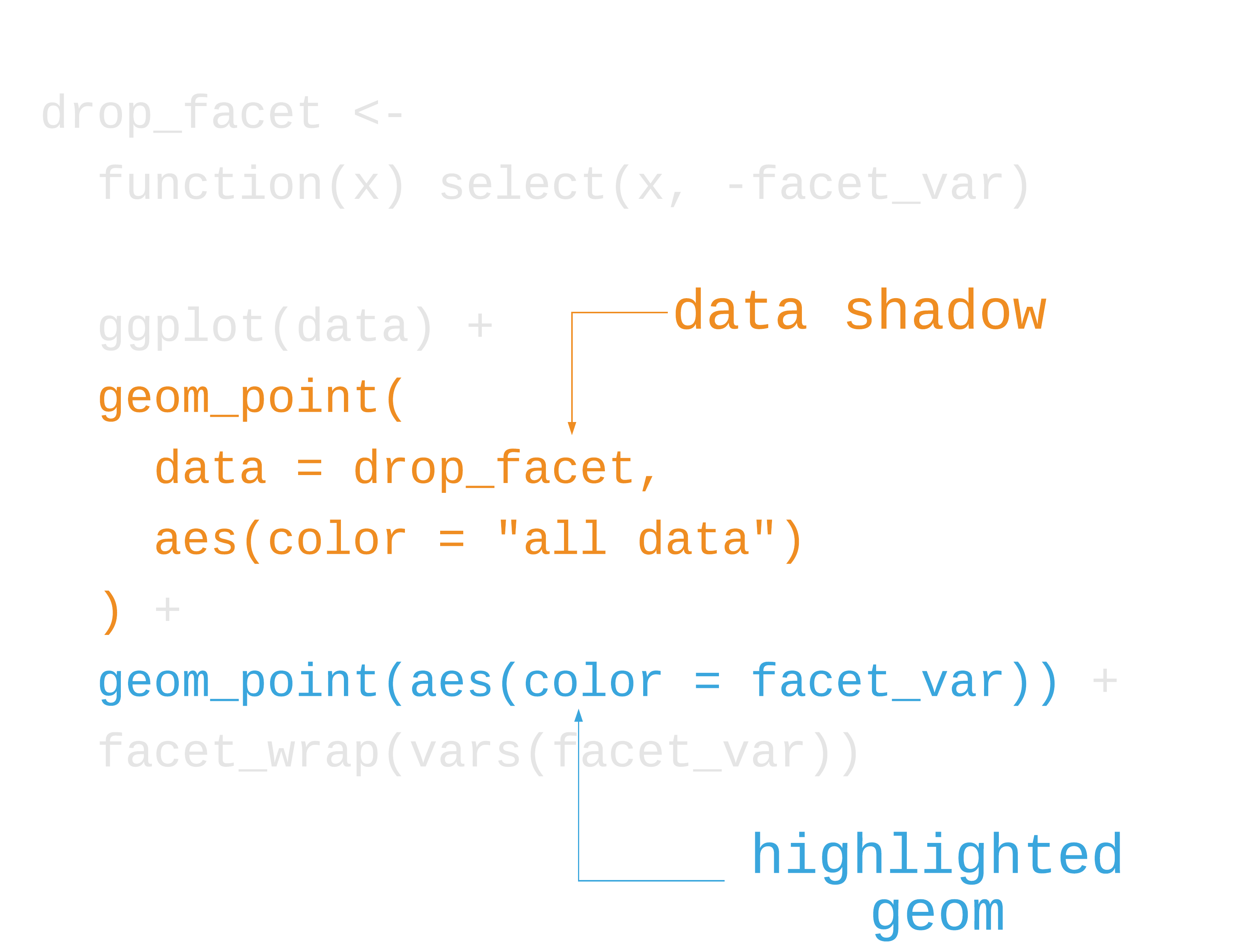
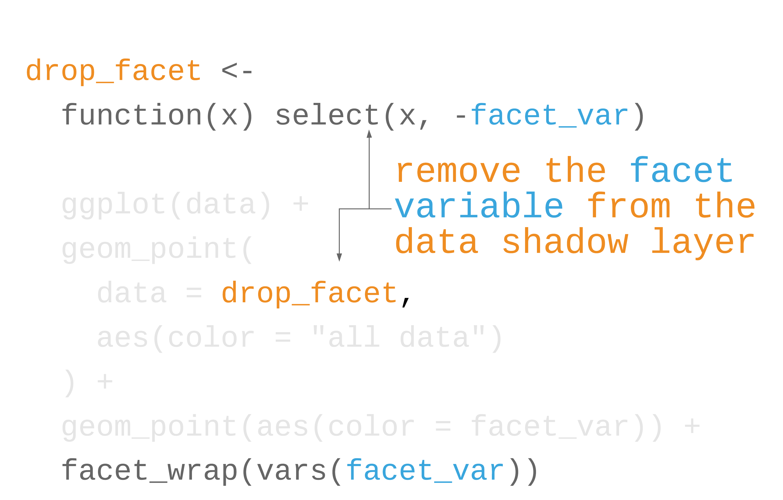
label_colors <- c("all squirrels" = "grey75", "highlighted group" = "#0072B2")nyc_squirrels %>% drop_na(primary_fur_color) %>% ggplot() + geom_sf(data = central_park, color = "grey85") + geom_point( data = function(x) select(x, -primary_fur_color), aes(x = long, y = lat, color = "all squirrels"), size = .8 ) + geom_point( aes(x = long, y = lat, color = "highlighted group"), size = .8 ) + cowplot::theme_map(16) + theme( legend.position = "bottom", legend.justification = "center" ) + facet_wrap(vars(primary_fur_color)) + scale_color_manual(name = NULL, values = label_colors) + guides(color = guide_legend(override.aes = list(size = 3)))73 / 121
74 / 121

75 / 121
76 / 121
77 / 121
78 / 121
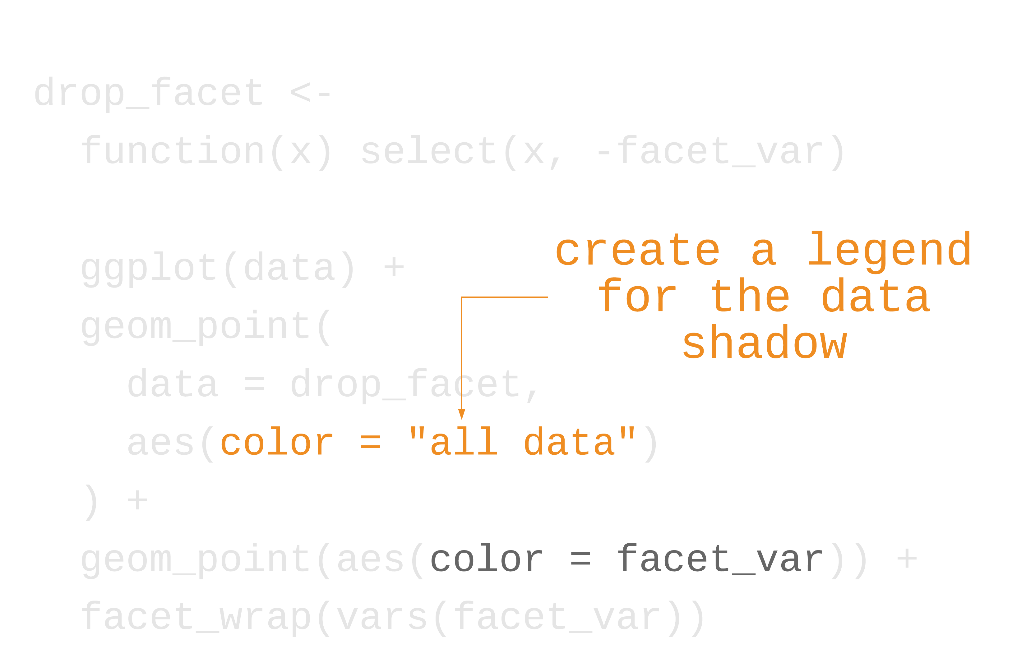
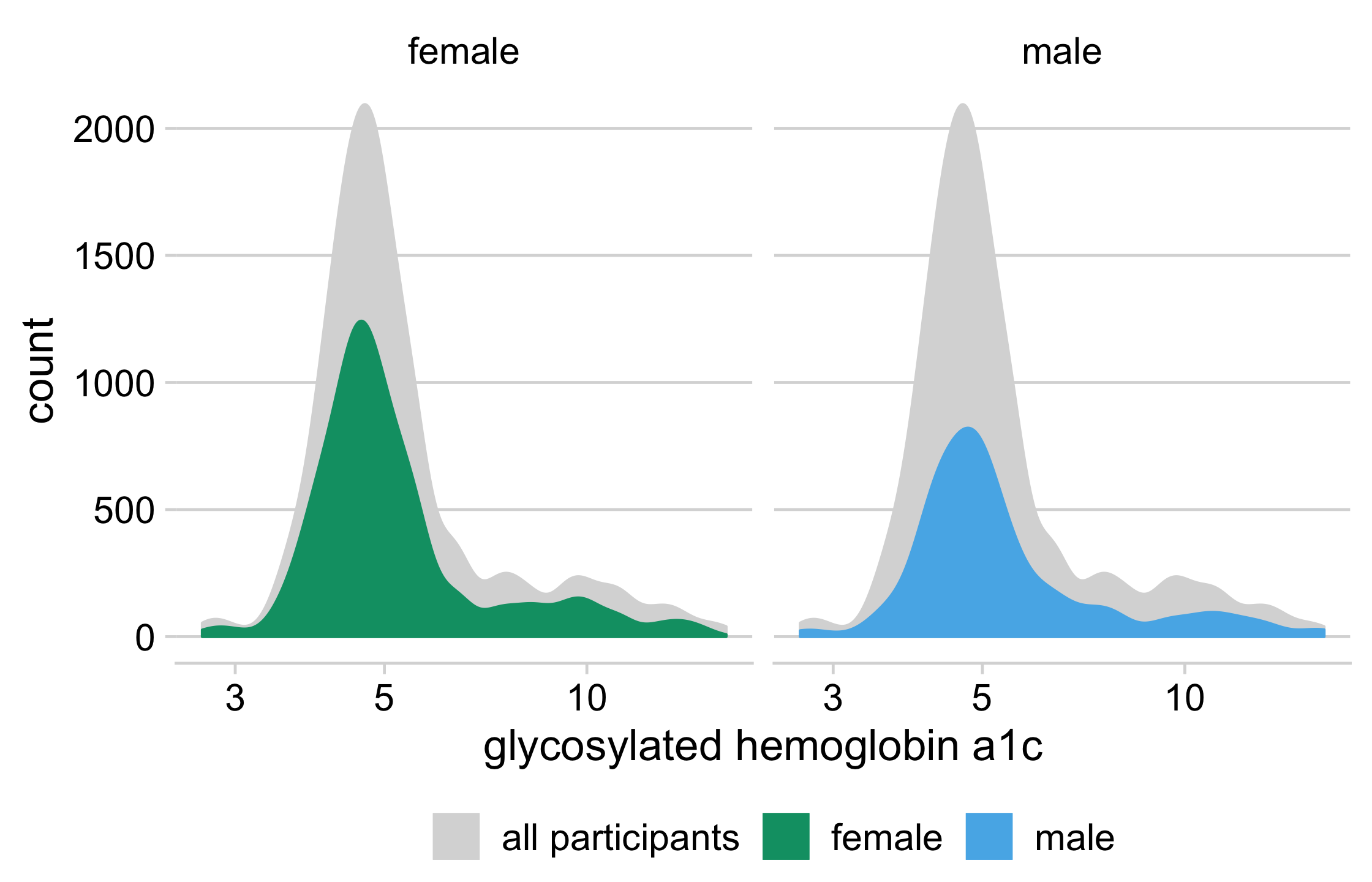
Your Turn 4
79 / 121
Your Turn 4
Run the code below and take a look at the resulting plot.
In the ggplot() function, add y = ..count.. to aes()
Add an additional geom_density() to the plot. This should go before the existing geom_density() so that it shows up in the background.
In the new geom_density(), set the data argument to be a function. This function should take a data frame and remove gender (which we're about to facet on).
Use aes() to set color and fill. Both should equal "all participants", not gender.
Use facet_wrap() to facet the plot by gender.
80 / 121
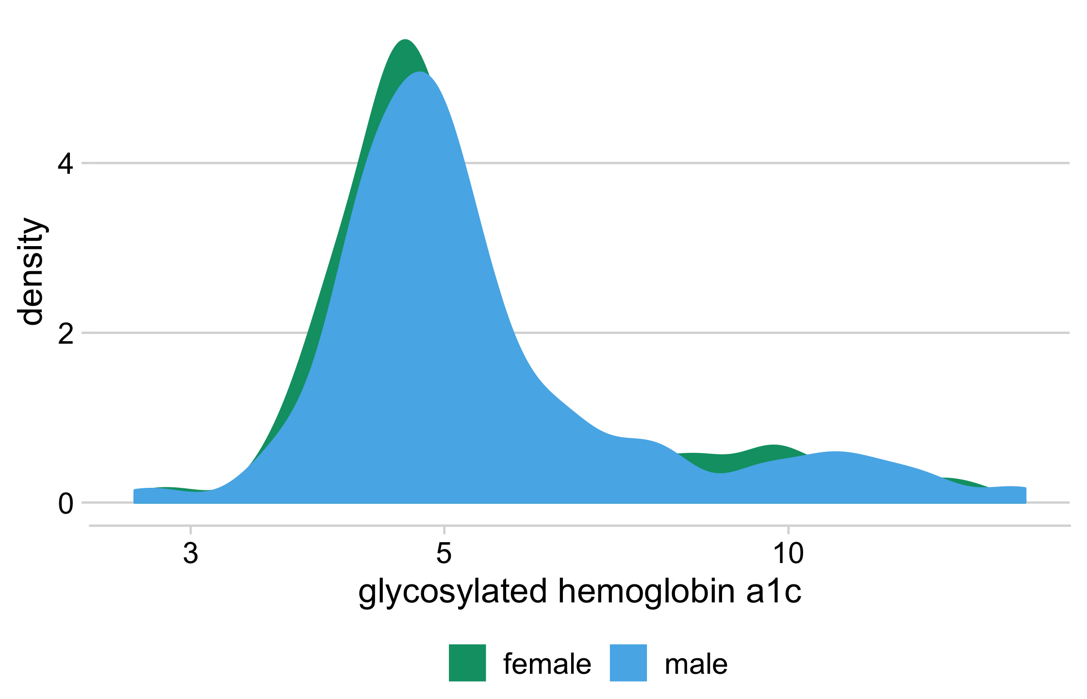
diabetes %>% drop_na(glyhb, gender) %>% ggplot(aes(glyhb, y = ..count..)) + geom_density( data = function(x) select(x, -gender), aes(fill = "all participants", color = "all participants") ) + geom_density(aes(fill = gender, color = gender)) + facet_wrap(vars(gender)) + scale_x_log10(name = "glycosylated hemoglobin a1c") + scale_color_manual(name = NULL, values = density_colors) + scale_fill_manual(name = NULL, values = density_colors) + theme_minimal_hgrid(16) + theme(legend.position = "bottom", legend.justification = "center")81 / 121
82 / 121
gghighlight: Highlight geoms
library(gghighlight)gghighlight(predicate)
Works with points, lines, and histograms
Facets well
83 / 121
Your Turn 5
84 / 121
Your Turn 5
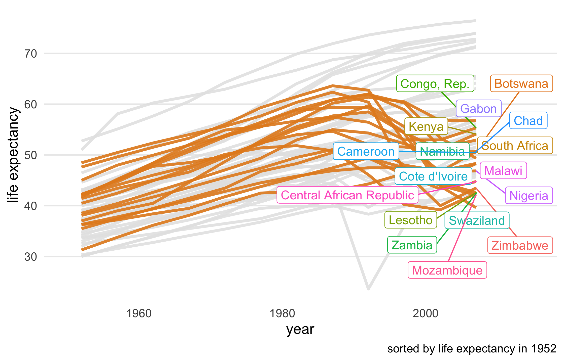
Take a look at the first few paragraphs of code. First, we're subsetting only African countries and sorting them by their life expectancy in 1952. Then, we're pivoting the data to be able to compare life expectancy in 1992 to 2007, creating a new variable, le_dropped, that is TRUE if life expectancy was higher in 1992. Then, we join le_dropped back to the data so we can use it in gghighlight(). Run the code at each step.
Remove the legend from the plot using the legend.position argument in theme(). Take a look at the base plot.
Use gghighlight() to add direct labels to the plot. For the first argument, tell it which lines to highlight using le_dropped. Also add the arguments use_group_by = FALSE and unhighlighted_colour = "grey90".
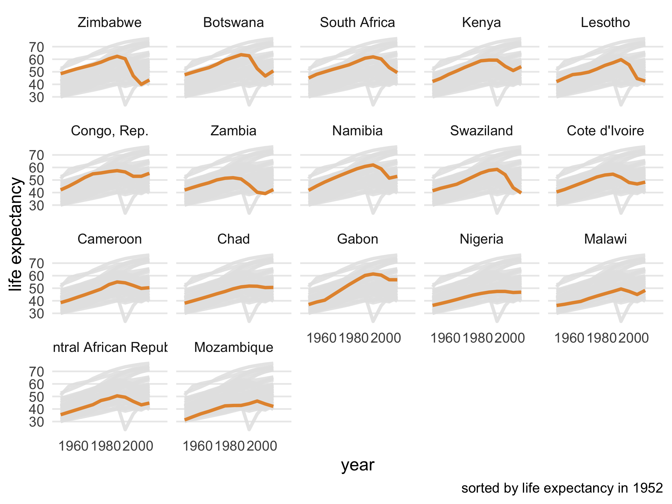
Add use_direct_label = FALSE to gghighlight() and then facet the plot (using facet_wrap()) by country
85 / 121
le_line_plot + gghighlight( le_dropped, use_group_by = FALSE, unhighlighted_colour = "grey90" )86 / 121
87 / 121
le_line_plot + gghighlight( le_dropped, use_group_by = FALSE, use_direct_label = FALSE, unhighlighted_colour = "grey90" ) + facet_wrap(vars(country))88 / 121
89 / 121
act two: narrate and put in context
90 / 121
act two: narrate and put in context
or: storytelling with data visualization
90 / 121
How do we augment plots to explain?
91 / 121
How do we augment plots to explain?
Annotate plots using text geoms and arrows
92 / 121
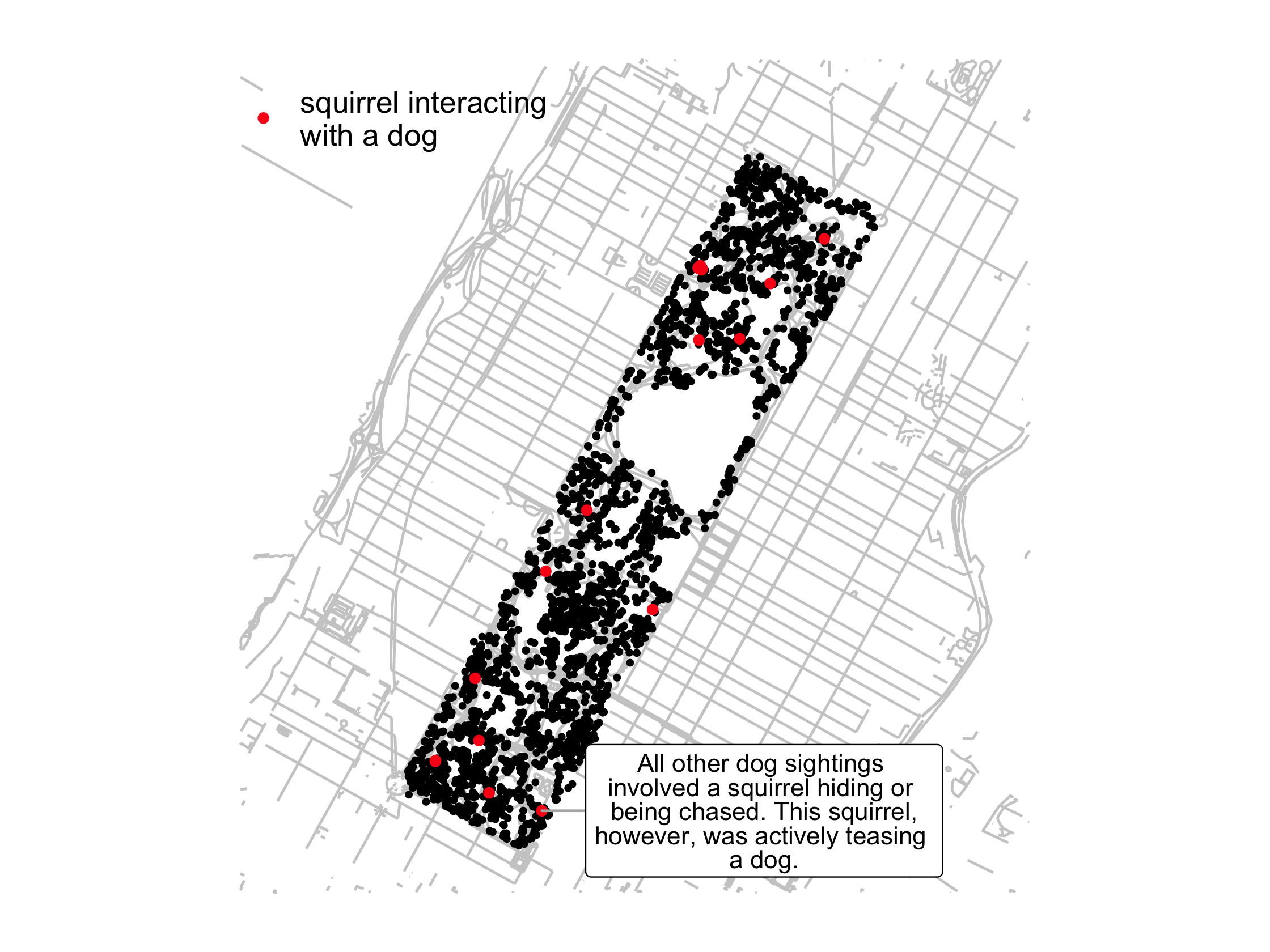
Squirrels and dogs
dog_sighting <- nyc_squirrels %>% mutate(dog = str_detect(other_activities, "dog")) %>% filter(dog)93 / 121
lbl <- "All other dog sightings involved a squirrel hiding or being chased. This squirrel,however, was actively teasing a dog."dog_plot <- nyc_squirrels %>% ggplot() + geom_sf(data = central_park, color = "grey80") + geom_point(aes(x = long, y = lat), size = .8) + geom_point( data = dog_sighting, aes( x = long, y = lat, color = "squirrel interacting\nwith a dog" ), size = 1.5 )94 / 121
dog_plot + ggrepel::geom_label_repel( data = filter( dog_sighting, str_detect(other_activities, "teasing") ), aes(x = long, y = lat, label = lbl), nudge_x = .015, size = 3.5, lineheight = .8, segment.color = "grey70" ) + cowplot::theme_map() + theme(legend.position = c(.05, .9)) + scale_color_manual(name = NULL, values = "#FB1919")95 / 121
96 / 121
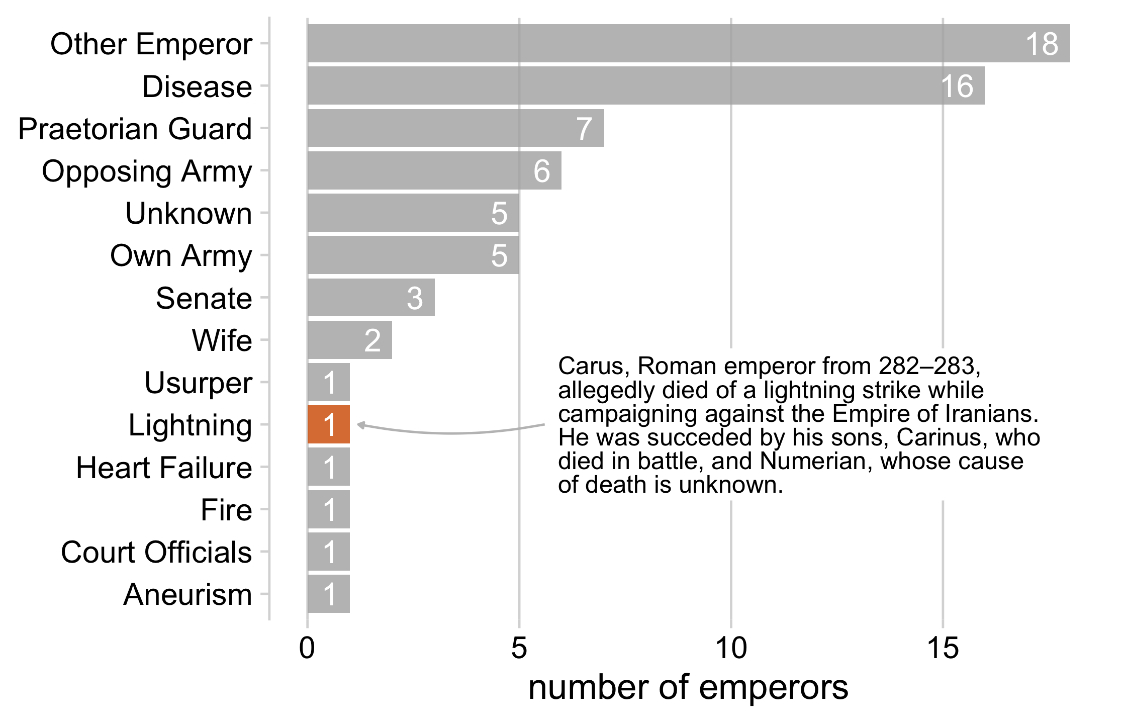
label <- "Carus, Roman emperor from 282–283,allegedly died of a lightning strike while campaigning against the Empire of Iranians. He was succeded by his sons, Carinus, who died in battle, and Numerian, whose cause of death is unknown."lightning_plot + geom_label( data = data.frame(x = 5.8, y = 5, label = label), aes(x = x, y = y, label = label), hjust = 0, lineheight = .8, inherit.aes = FALSE, label.size = NA ) + geom_curve( data = data.frame(x = 5.6, y = 5, xend = 1.2, yend = 5), mapping = aes(x = x, y = y, xend = xend, yend = yend), colour = "grey75", size = 0.5, curvature = -0.1, arrow = arrow(length = unit(0.01, "npc"), type = "closed"), inherit.aes = FALSE )97 / 121
98 / 121

99 / 121
100 / 121
Your Turn 6
101 / 121
Your Turn 6
Run the first code chunk and take a look at the map of surface heat in Los Angeles.
In the second code chunk, we need to create two new data frames to draw the annotations and arrows. Pick a name for each.
Add geom_text() and geom_curve() to base_map. Give each geom the relevant data that you just named in (2).
Let's clean up the geoms a bit. Reduce the lineheight of the text geom to 0.8. Then, add arrows to the curve geom usiing the arrow() function. Give it two arguments: length = unit(0.01, "npc") and type = "closed". Run the plot.
One of the labels is being clipped because it runs off the main plotting panel. Add coord_sf(clip = "off") to prevent clipping the text.
102 / 121
text_labels <- tibble::tribble( ~x, ~y, ~label, -118.90, 34.00, west_label, -118.20, 34.22, east_label)arrows <- tibble::tribble( ~x, ~y, ~xend, ~yend, -118.73, 34.035, -118.60, 34.10, -118.21, 34.195, -118.35, 34.18, -118.08, 34.185, -118.15, 34.10 )103 / 121
base_map + geom_text( data = text_labels, aes(x, y, label = label), hjust = 0, vjust = 0.5, lineheight = .8 ) + geom_curve( data = arrows, aes(x =x, y = y, xend = xend, yend = yend), colour = "grey75", size = 0.3, curvature = -0.1, arrow = arrow(length = unit(0.01, "npc"), type = "closed") ) + coord_sf(clip = "off")104 / 121
105 / 121
How do we augment plots to explain?
Annotate plots using text geoms and arrows
Combine plots to build a cohesive narrative
106 / 121
Combine plots to tell a story
- Build plots up from simpler to more complex
- Don't use the same type of plot in each panel
- Use consistent color
107 / 121
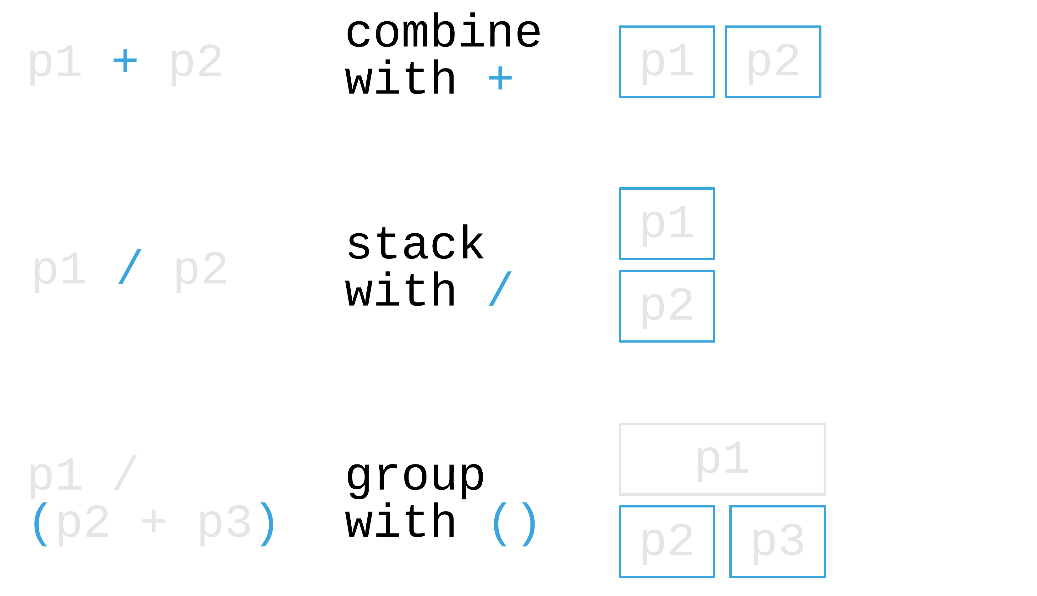
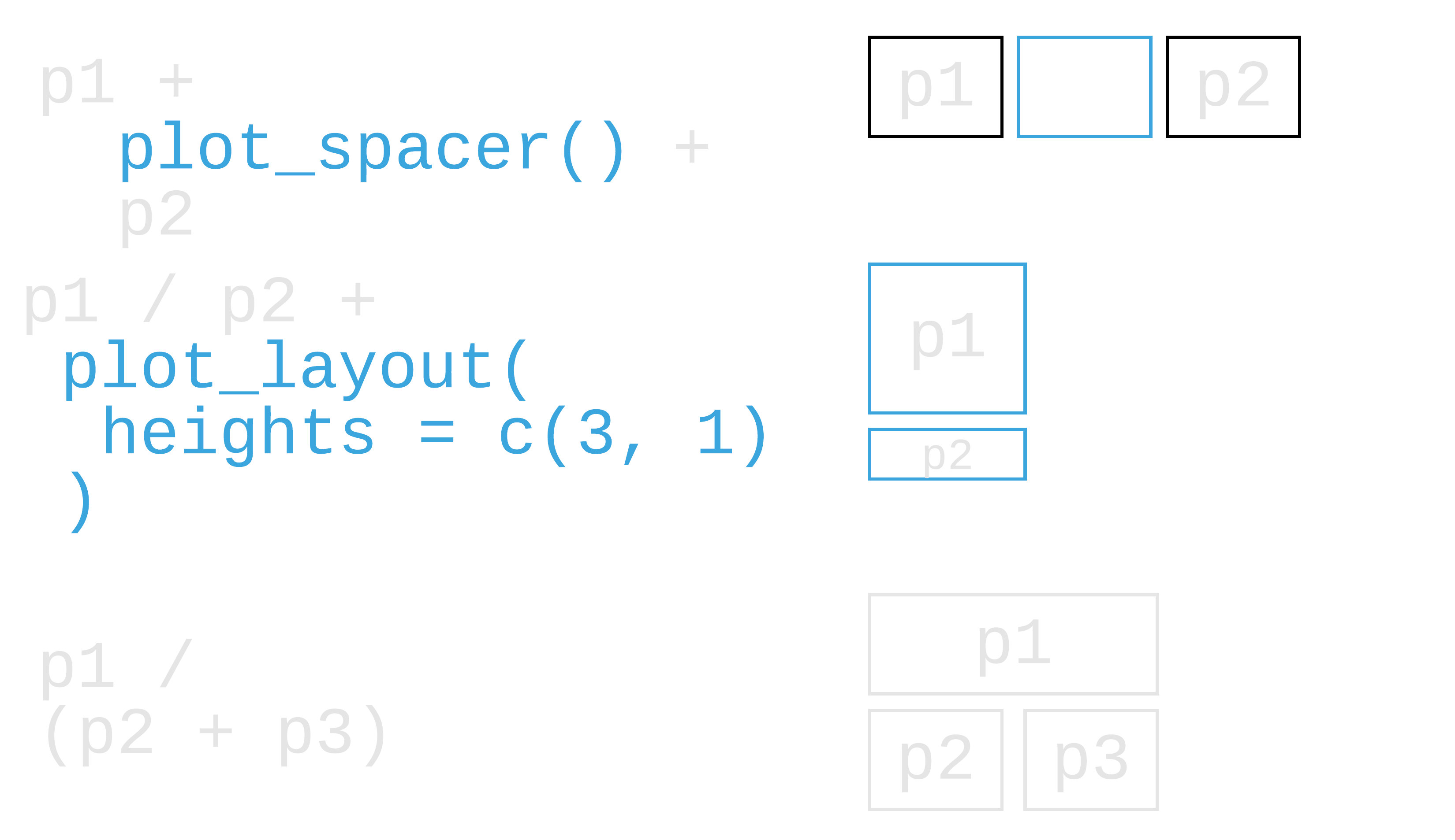
patchwork: Compose ggplots
library(patchwork)108 / 121
109 / 121
110 / 121
111 / 121
Your Turn 7
112 / 121
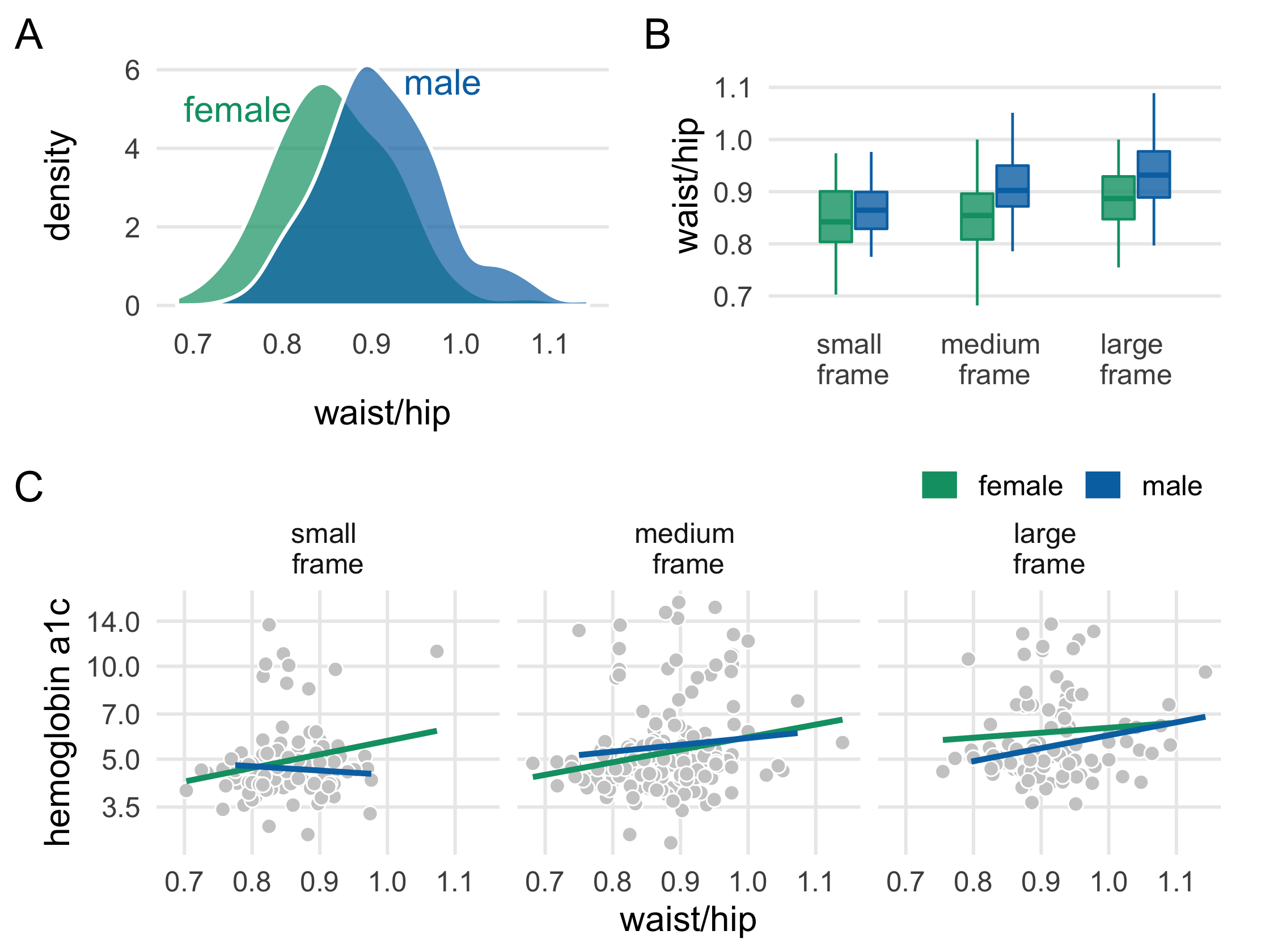
Run the first code chunk. label_frames() will help us label the frame variable better. theme_multiplot() is the theme we'll add to each plot. We'll use diabetes_complete for the plots (removing the missing values of the variables we're plotting produce the same plots as diabetes would, but it prevents ggplot2 from warning us that it's dropping the data internally). Nothing to change here!
Run the code for plot_a and take a look. Nothing to change here, either!
The colors in plot_b don't match plot_a. Add scale_color_manual() to make the colors consistent.
Also add scale_fill_manual(). For the fill colors, we'll add a bit of transparency. Paste "B3" to the end of the colors in plot_colors. "B3" is equivalent to 70% transparency (or alpha = .7) in hex code (see this GitHub page with translations from percent to hex, but note that in R you need to put the transparency at the end of the six character hex code).
This plot doesn't have a tag label like the other two plots. Add one to the labs() call.
The legend isn't working well, but let's take advantage of it. We'll move the legend to above the plot by setting legend.position to c(1, 1.25) in theme(). We wont' be able to see it in plot_c, but it will show up in the combined plot!
Finally, combine the 3 plots using patchwork. Have plot_a and plot_b on top and plot_c on the bottom.
113 / 121
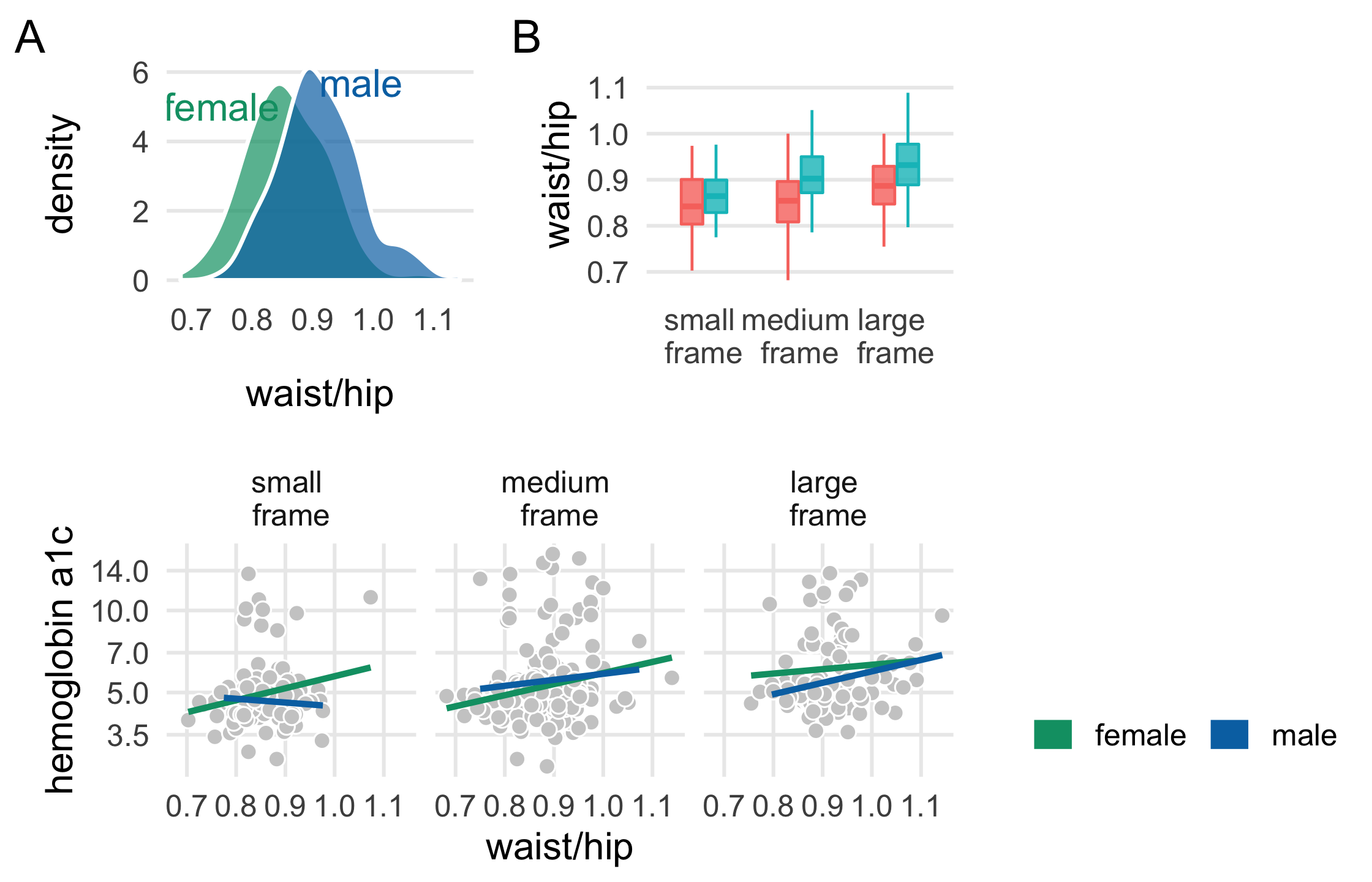
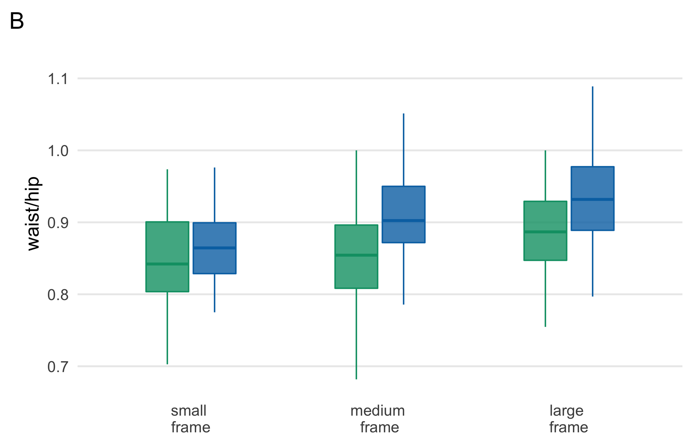
plot_b <- diabetes_complete %>% ggplot( aes(fct_rev(frame), waist/hip, fill = gender, col = gender) ) + geom_boxplot( outlier.color = NA, alpha = .8, width = .5 ) + theme_multiplot() + theme(axis.title.x = element_blank()) + scale_color_manual(values = plot_colors) + scale_fill_manual(values = paste0(plot_colors, "B0")) + scale_x_discrete(labels = label_frames) + labs(tag = "B")plot_b114 / 121
115 / 121
plot_c <- diabetes_complete %>% ggplot(aes(waist/hip, glyhb, col = gender)) + geom_point( shape = 21, col = "white", fill = "grey80", size = 2.5 ) + geom_smooth( method = "lm", formula = y ~ x, se = FALSE, size = 1.1 ) + theme_minimal(base_size = 14) + theme( legend.position = c(1, 1.25), legend.justification = c(1, 0), legend.direction = "horizontal", panel.grid.minor = element_blank() ) + facet_wrap(~fct_rev(frame), labeller = as_labeller(label_frames)) + scale_y_log10(breaks = c(3.5, 5.0, 7.0, 10.0, 14.0)) + scale_color_manual(name = "", values = plot_colors) + guides(color = guide_legend(override.aes = list(size = 5))) + labs(y = "hemoglobin a1c", tag = "C")plot_c116 / 121
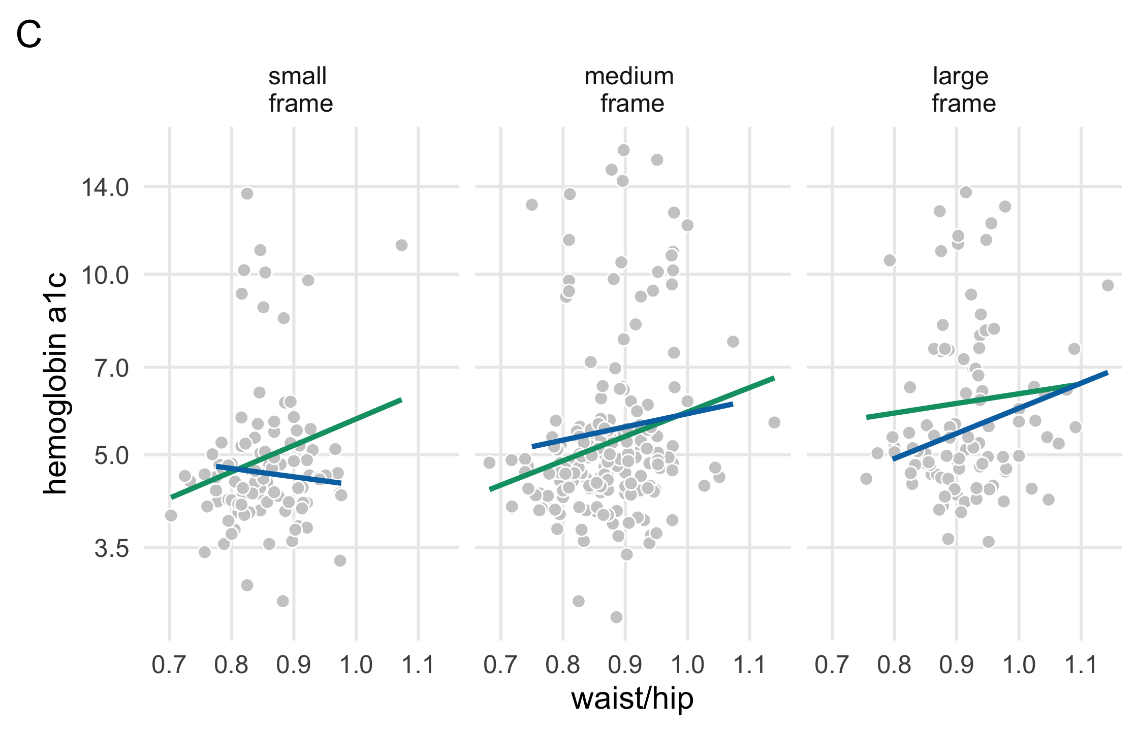
117 / 121
library(patchwork)(plot_a + plot_b) / plot_c118 / 121
119 / 121
Resources
Fundamentals of Data Visualization by Claus O. Wilke
Storytelling with Data by Cole Nussbaumer Knaflic
Better Presentations by Jonathan Schwabish
120 / 121